Olivera
Case Study
Branding and strategy for a senior-centric primary care provider
Healthcare

the challenge
Olivera was the win-win primary care solution senior facilities were searching for. They offered top-tier onsite care with none of the hassle of hiring inhouse.
The thing was, they were brand new. What would make an established facility trust them?


what was their next?
We created a brand strategy based on the idea that without Olivera, care facilities and residents were limited. By partnering with Olivera, they could provide and receive high quality care in its truest form.

the process
We began by grounding Olivera with a mission of providing more.
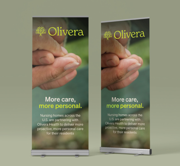
Messaging highlighted Olivera’s ability to empower care facilities with more preventative care, more personal care, more access to quality care, and more continuity of care.
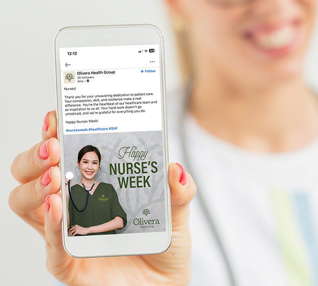
We emphasized the collaborative nature of the brand, utilizing a tone of voice that while knowledgeable, always remained empathetic and empowering to caregivers and patients alike.


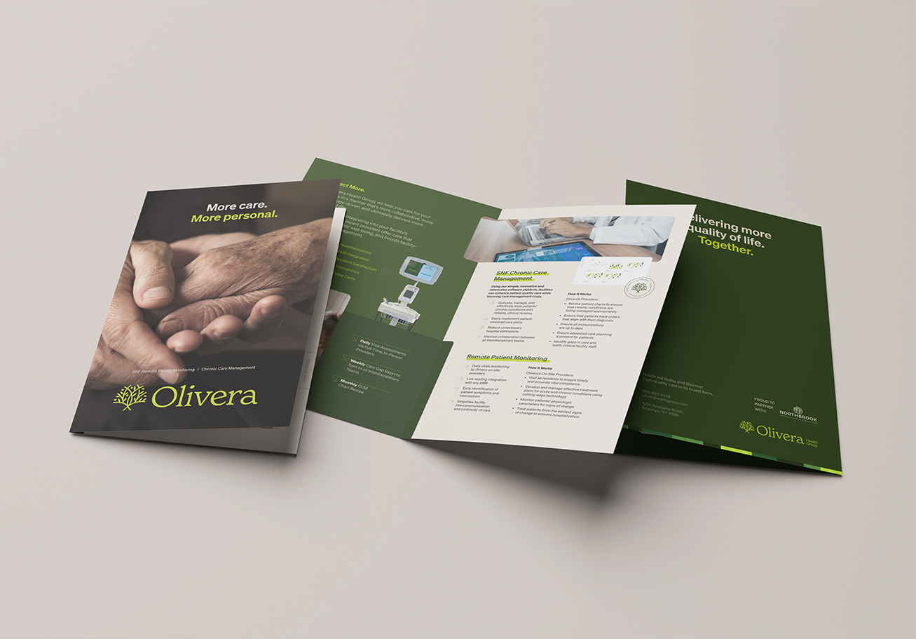
In order for this young brand to fit in with the traditional healthcare industry, we had to create a visual identity that felt timeless and established.
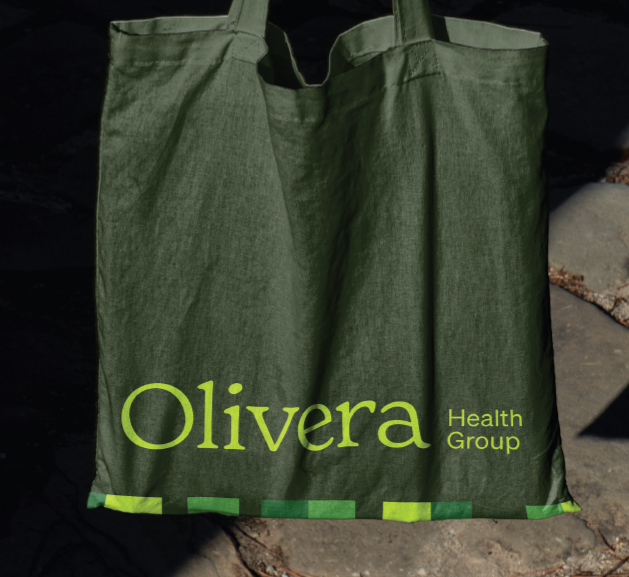
The branches of the olive tree in the logo’s iconmark alluded to the various services Olivera provided and was complemented by a classic serif logo typeface.
We used a beautiful color palette of olive greens, with bold header typography and pops of lime green to keep the brand feeling fresh and original.
The photography style we curated was warm and personal, and gave over the heartfelt care that Olivera’s providers embodied.
the results
Olivera’s branding and strategy allowed them to gain a foothold in the healthcare industry immediately.
And by providing better care for residents and better service for the facilities they partnered with, they fulfilled and delivered on their promise of being and doing more.