A brand identity and collateral for a line of bioactive remedies.
Consumer Goods
the challenge
From an itchy rash to a painful burn, or muscle aches- customers in pain need to know that the product they’re purchasing works well – and works fast.
Although Marie had a loyal customer base who recognized the power of its plant-based remedies, the outlook of the average pharmacy shopper toward plant-based healing was skepticism – hesitancy at best.
what was their
next?
We needed to firmly position Marie as a legitimate ailment-altering solution that would compete just as well with mass-market pharmaceutical brands as with niche, natural brands.
the process
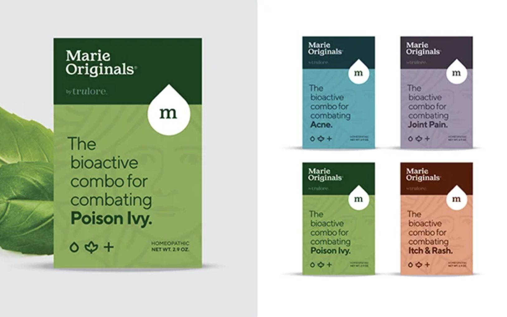
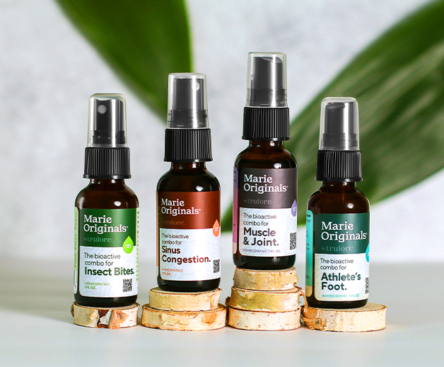
Using classic typography, and a vintage-inspired custom illustration, we created an aura of established legitimacy to communicate to customers that this stuff was tried and true.
A soothing color palette and clear iconography were designed to catch customers' attention- and have them clicking add-to-cart in the crowded Amazon and online marketplaces.
We knew that customers seeking pain relief needed a brief, simple explanation (not a fancy, complicated one!) of how the products worked so that they knew that what they were buying was legit.
Using clear, consistent, and direct language on packaging and labels, we highlighted Marie’s targeted treatments and unique ingredients – allowing customers to easily find the products they need.
the results
By positioning Marie as a powerhouse hybrid of raw nature and calculated science, we enabled customers to feel comfortable trying the natural route.
With 100s of 5-star reviews on Amazon, the transformative results of this product line are apparent- and we couldn’t be prouder to have bought them to life.