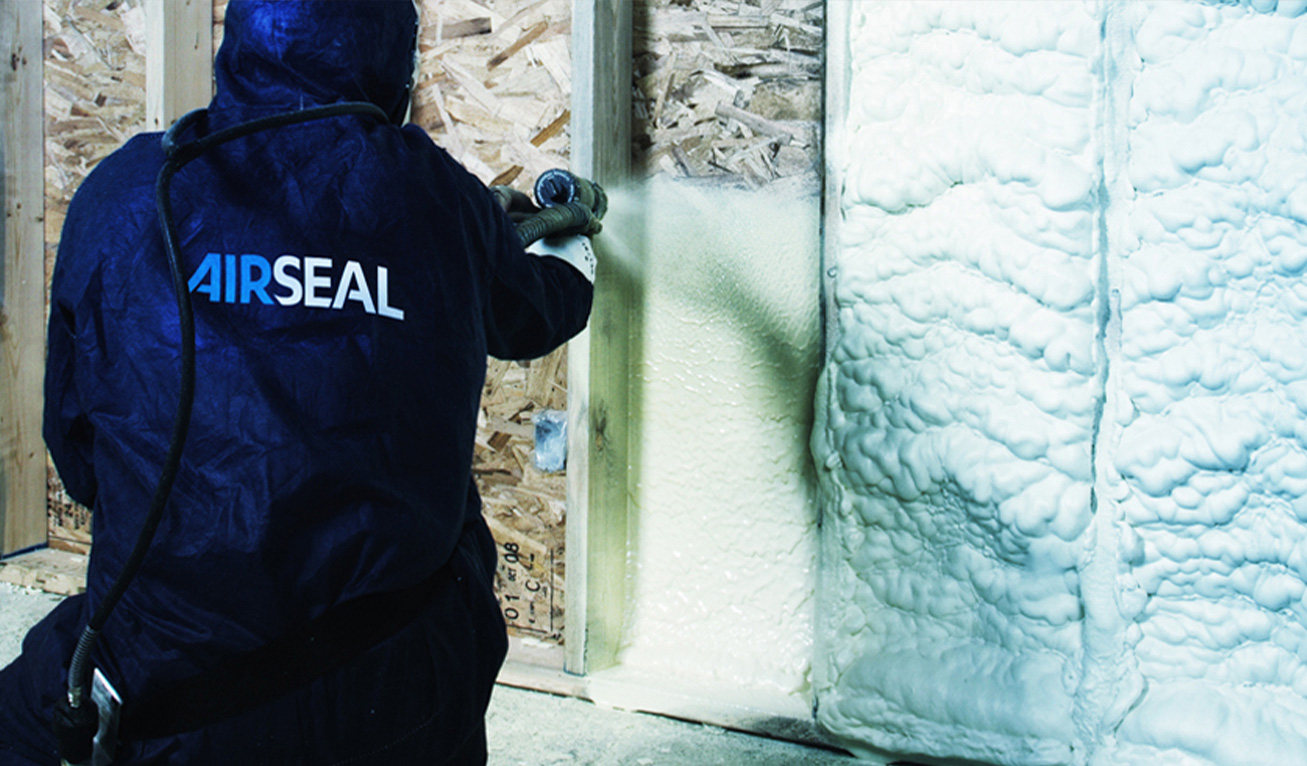
As a multi-divisional company offering various insulation-based solutions, Airseal’s capabilities went far beyond “spray foam.”
While they had existing brand equity, it lacked consistency and polish – a complete misrepresentation of their team’s expertise, skill, and professionalism.
what was their
next?
Without shedding the existing brand equity, we needed to emphasize Airseal’s standing as a market leader, connect the full spectrum of its diverse target markets, and portray its variety of services under one corporate banner.
the process
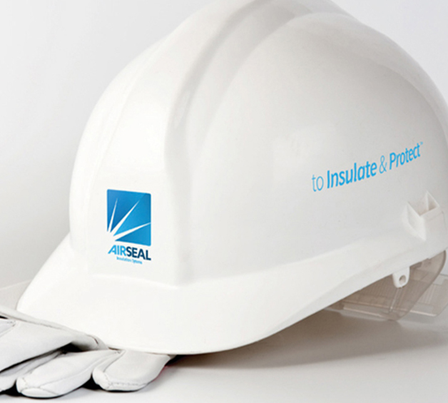
To begin, our design team refreshed the existing logo and overall branding to exude a revitalized sense of confidence, boldness, and cohesiveness.
The logo mark’s generic font was updated to a custom typeface and the starburst made more pronounced to better convey the strength of Airseals insulation.
In addition to branding, Airseal was looking for a powerful way to market their services.
Hidden between scaffolding and sheetrock, those services went largely unseen, so we came up with a way to bring Airseal into spotlight.
We introduced the public to the Seal Team - the brave, bold, valiant defenders protecting against shoddy insulation, leaky windows, and spray foam hazards.
the results
More than 10 years later, Airseal’s branding has withstood the test of time- fresh and modern, and now- iconic.
What’s even more, their signature squad is still proudly emblazoned across their installation trucks - and in the minds of anyone needing insulation services.