The Arches offered an unparalleled opportunity for residents looking for a gateway to the heart of the city - and an easy way out of the hustle too.
The developer, Chess Builders, needed us to showcase the building’s beauty while highlighting the convenience of the numerous amenities and services available to residents.
what was their
next?
While other neighborhoods and buildings offered residents a place to live, The Arches offered a way to live.
So before we got into the technical breakdown of the building’s features, we needed to convey the overall lifestyle The Arches was making available- one of convenience, ease, and inspired living.
the process
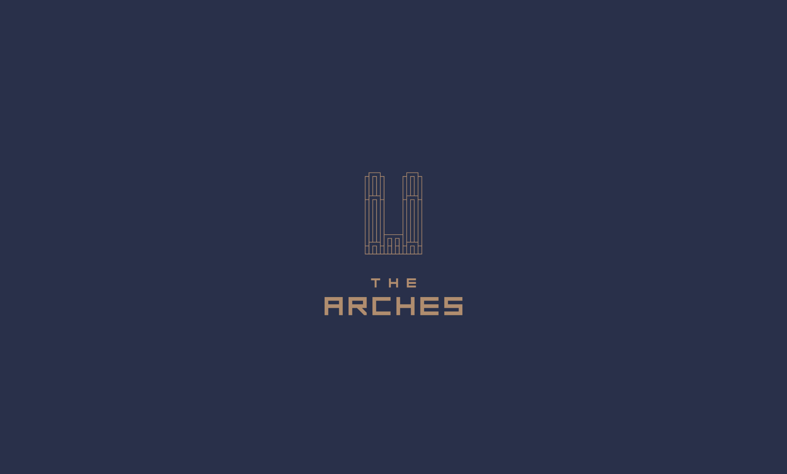
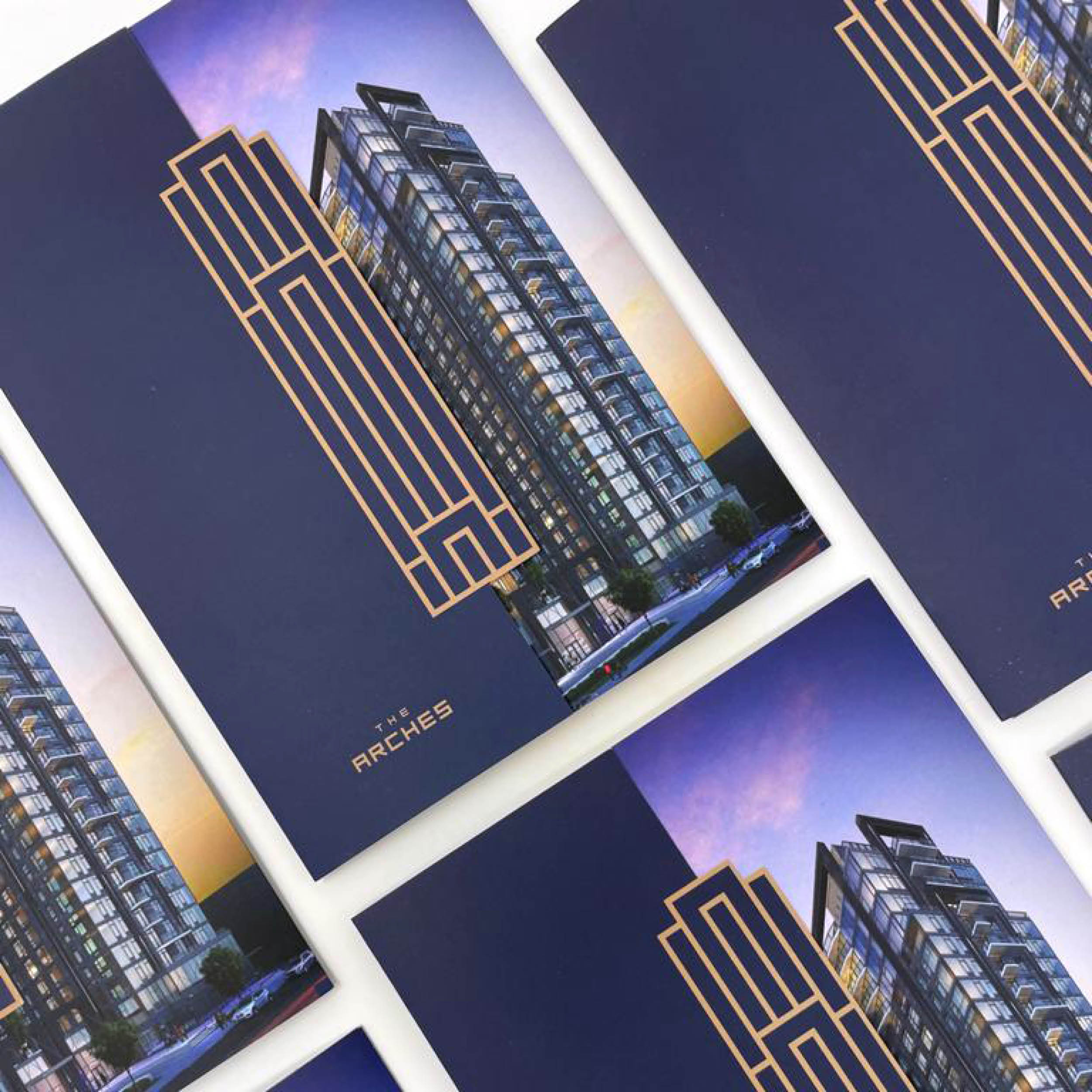
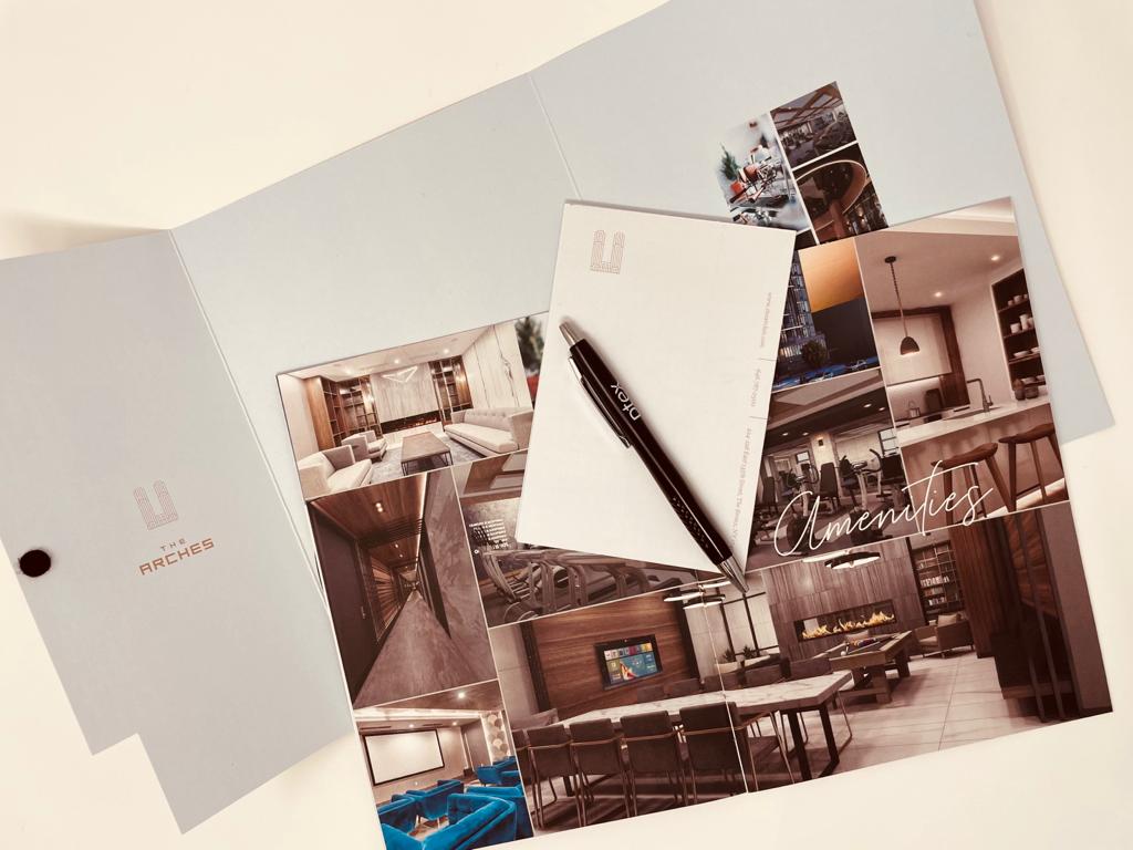
The name was inspired by the building’s exterior, with its central, unifying arch - a new landmark in the neighborhood of Mott Haven. A bold typeface logo was designed to reflect that angular arch shape, forming a modern and easily adaptable identity.
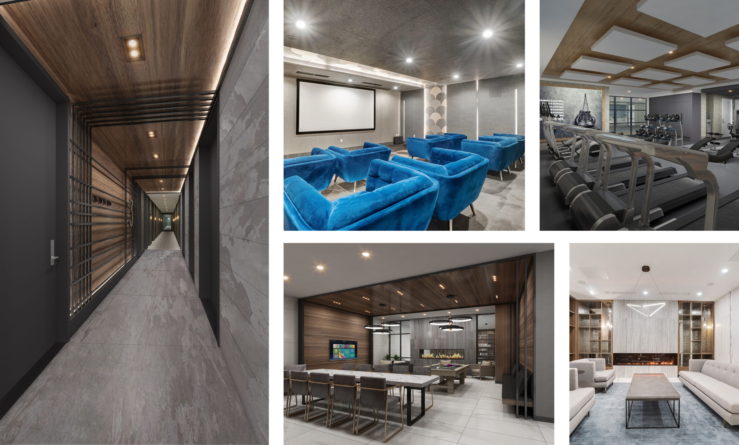
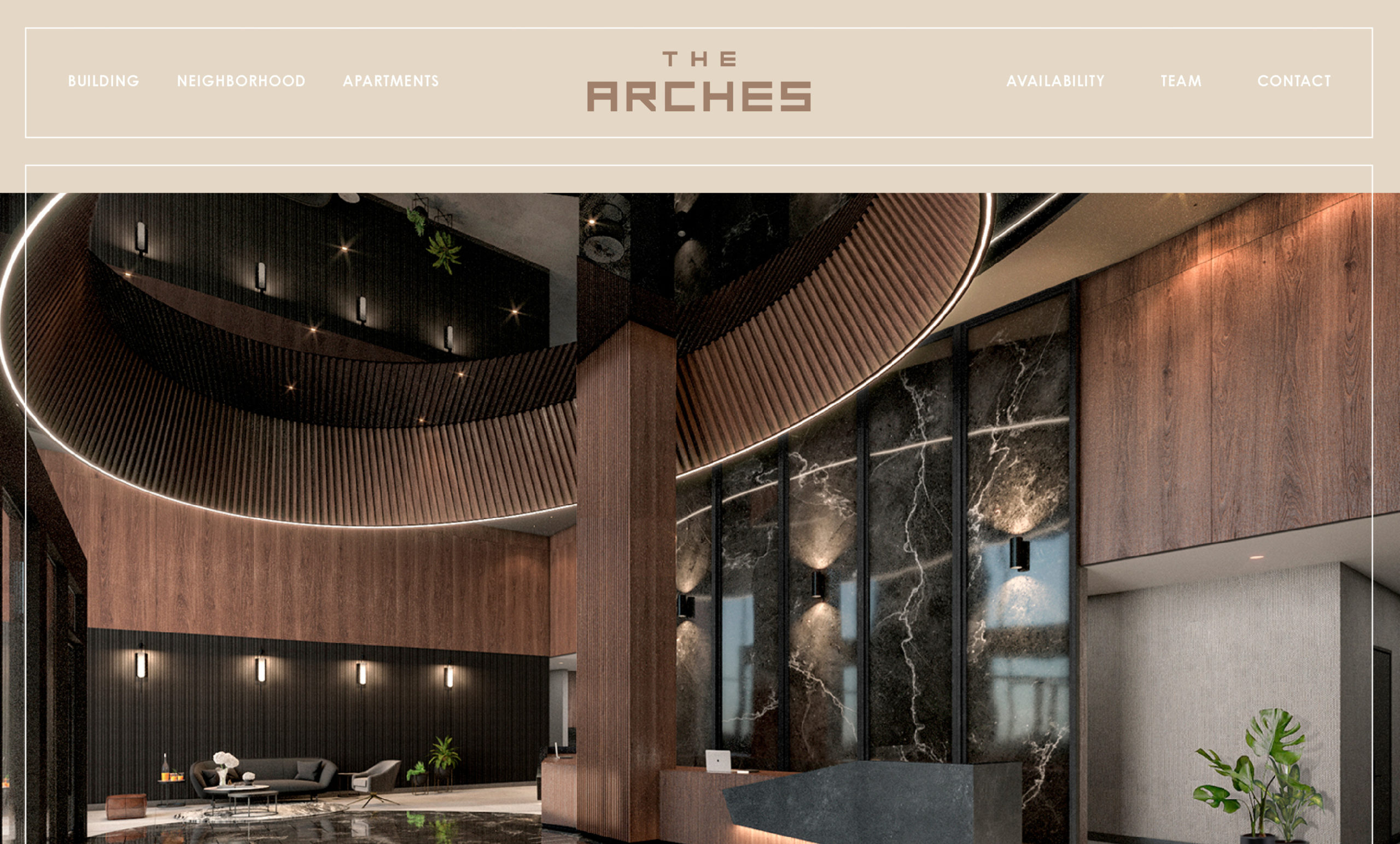
The brand’s typography, iconography, and color palette were chosen to mesh seamlessly with the building’s sleek, elevated interior design, and to create an upscale feel across all deliverables.
In addition to the standard amenities, residents were also offered an opportunity to enroll at The Club at The Arches, with privileged access to premium amenities, including a fitness club, rooftop lounge, and more.
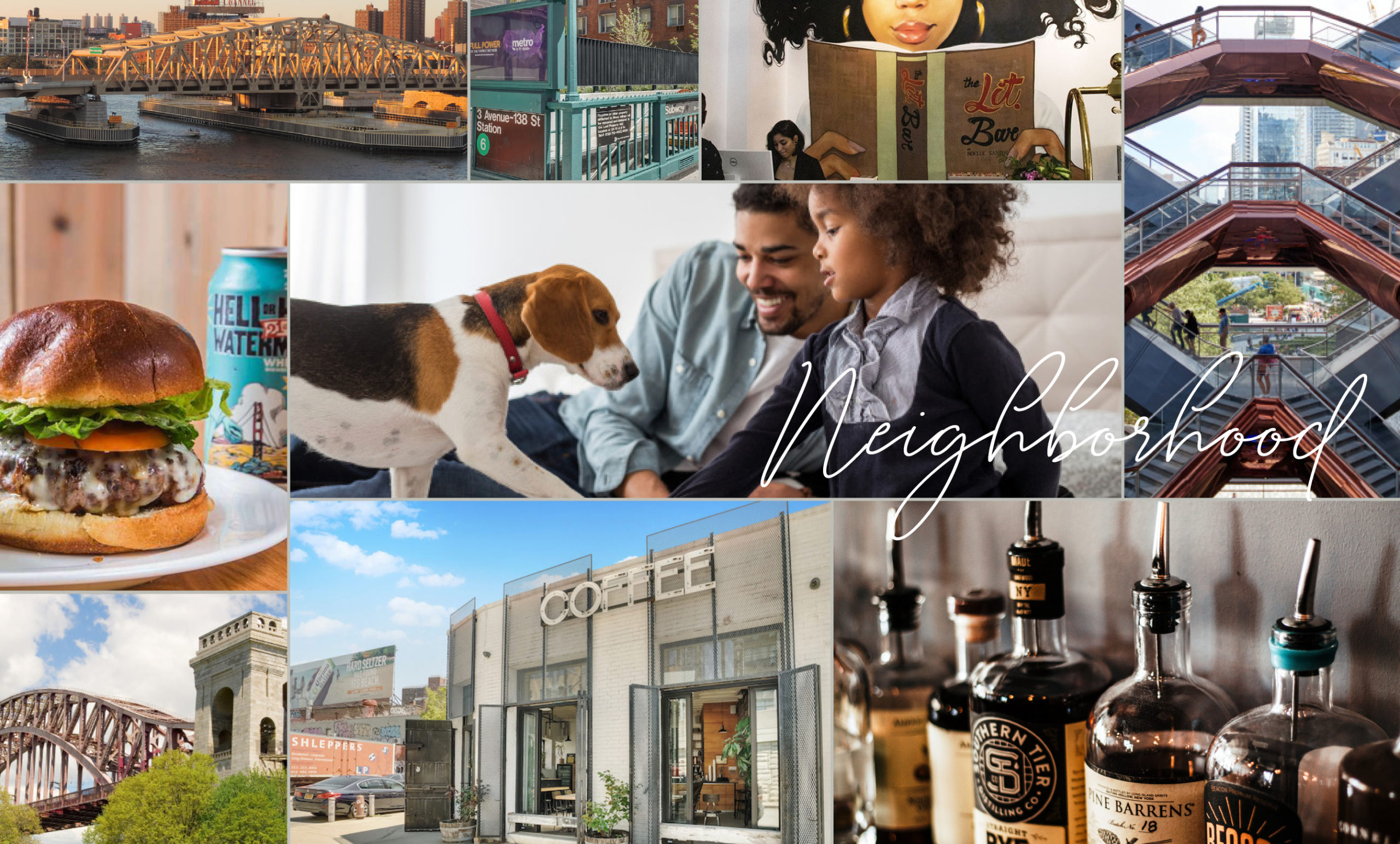
Messaging highlighted The Arches’ culturally rich location and amazing accessibility to upstate New York, with beautifully designed maps offering residents an informative overview of the area.
the results
With a solid, sophisticated brand in place, and a unique visual identity to set itself apart, the Arches ushered in a new era of upscale living in Mott Haven.