Atrium
Case Study
Brand identity and interior direction for a boutique apartment building
the challenge
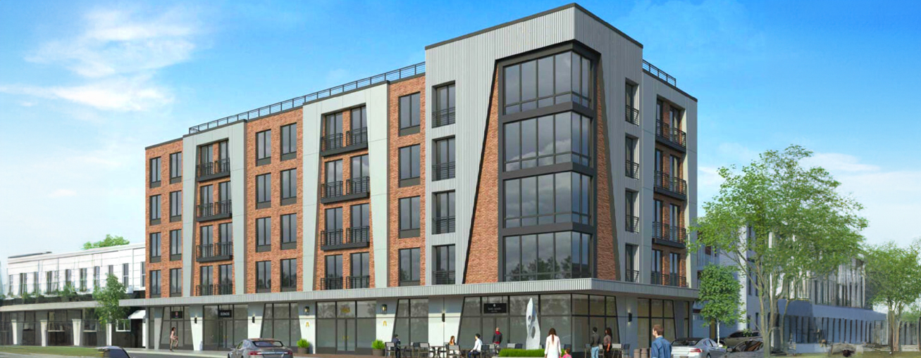
Just 35 minutes from New York City, with a street-level lounge, rooftop deck, and modern living spaces, the Atrium had much to offer.
But in a neighborhood with new, beautiful residential building constantly cropping up, the developers wanted to dial up the wow factor to attract their desired crowd of savvy, up and coming young professionals.
what was their next?
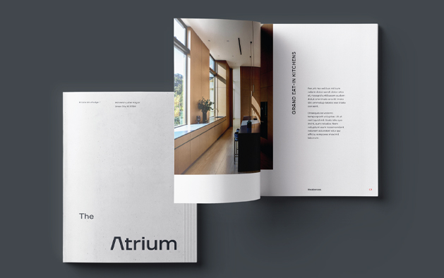
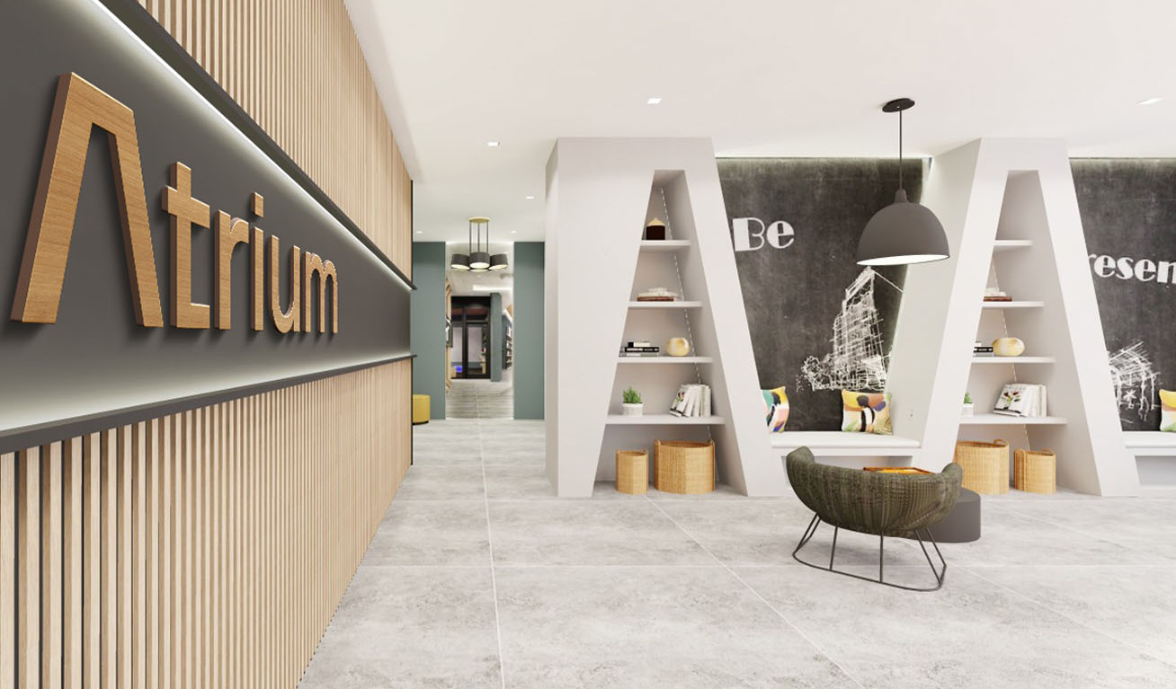
For the Atrium to truly stand out, we needed to create a brand that could live just as well in the real world as it could on paper. A brand with texture and depth, that could be touched, and felt, and lived in on a day-to-day basis.
the process
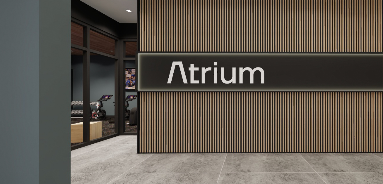
To begin, our designers crafted a striking, modern visual identity with a bit of an edge. Paneling and concrete formed the base for the brand’s patterns, with the actual real-life materials incorporated throughout the building itself.
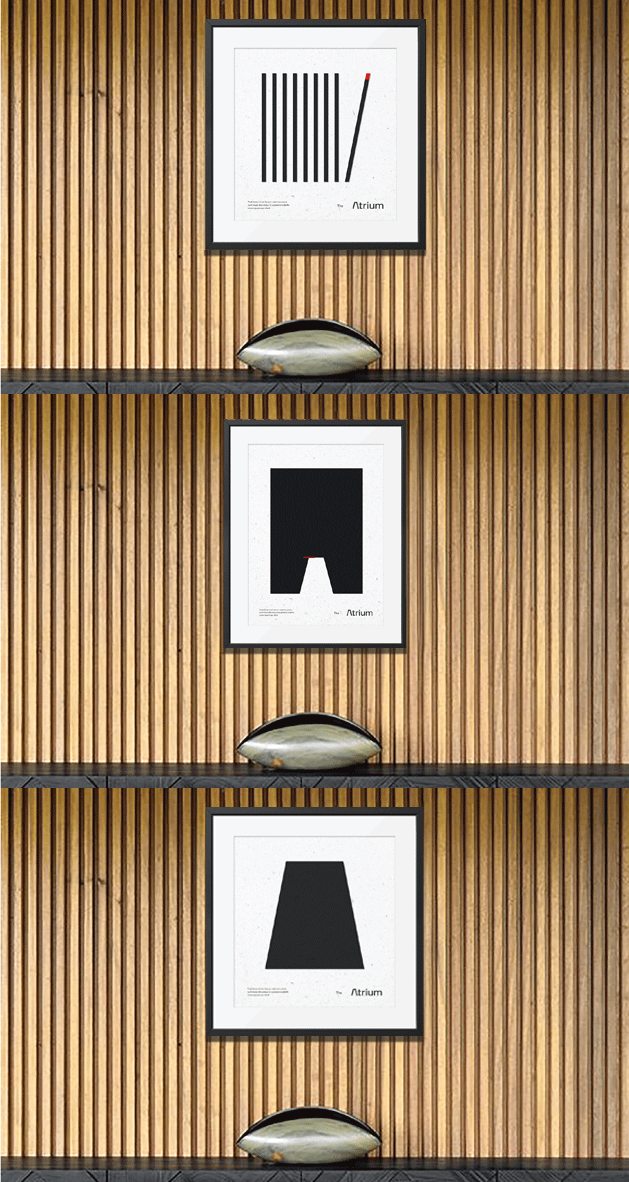
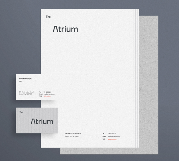
In addition to the visual identity, crisp, fresh, yet inviting messaging set the tone for a brand that was all that- and more.
the results
By bringing the brand elements into the physical interior design, we created a memorable, seamless brand experience, welcoming residents and visitors to a dynamic space saturated with sophisticated detail.
