Over the years, Avenium earned the trust of long-term partners nationwide for its rock-solid approach to real estate investments. While their original name and branding were still working, legal issues had forced them to rename the company.
They approached Ptex to create a name, a brand identity to match, and a clear-cut strategy to bring together their two separate, yet related services - real estate investments, and property management.
what was their
next?
The value in Avenium’s offer lay not only in the returns they offered investors but also in the premium experience and relationships they cultivated. These relationships were also present in their hands-on, resident-centric property management services, with their high tenant satisfaction rate stimulating greater value for investors.
To tell the story of Avenium’s success, we needed to start at the beginning - the human touch that set them apart.
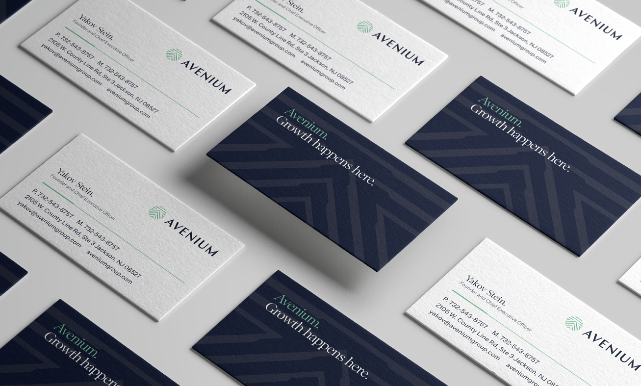
Derived from the Hebrew word for stone, the name Avenium conveys the firm’s strength, endurance, and rock-solid reliability.
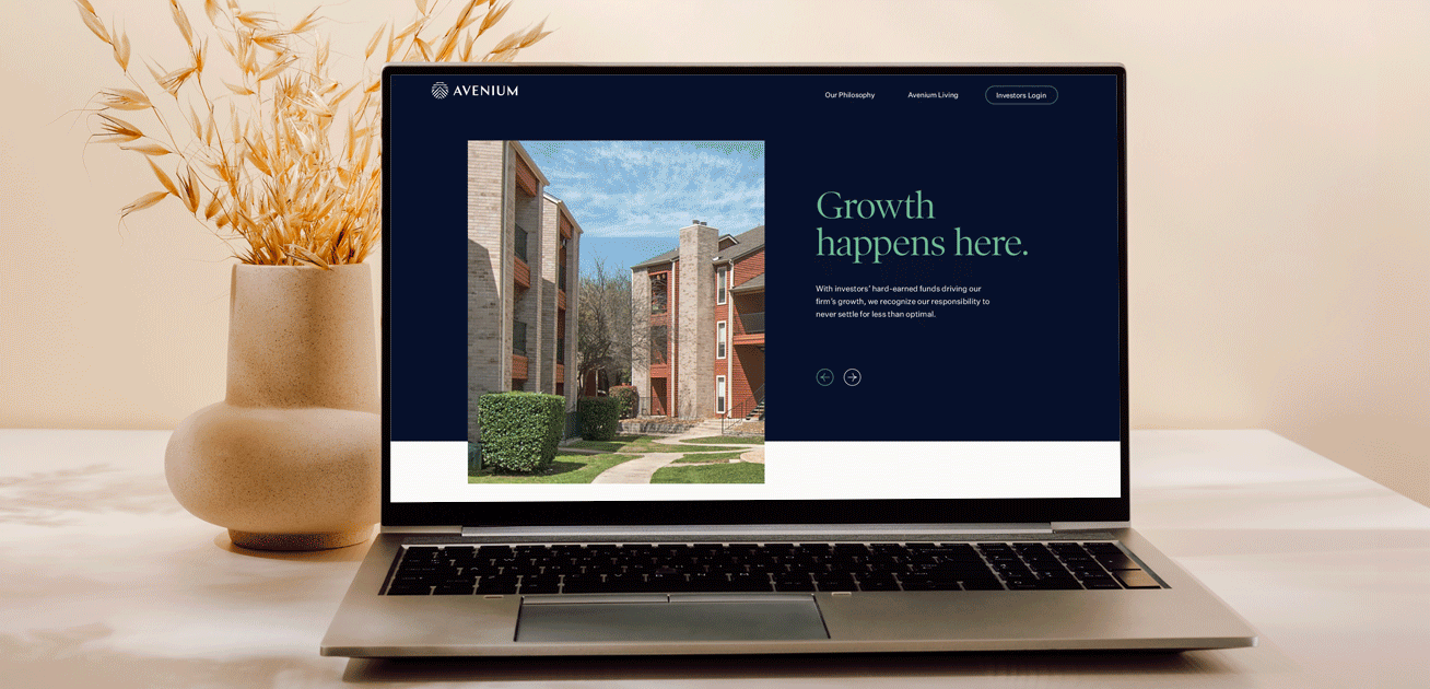
We created a tagline of ‘Growth happens here’ to project Avenium’s legacy of success and capture its future ambition. Variable taglines offered flexibility for future brand messaging, including ‘Opportunity happens here”, “Upside happens here”, and ‘Value happens here”.
the process
As part of creating a strategic brand, the Ptex team worked together with the team at Avenium to create a clear brand hierarchy, namely breaking down the parent company, Avenium Group, into two sub-categories - Avenium Assets (investments) and Avenium Living (property management).
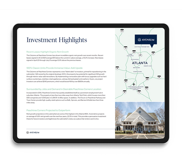
We worked closely with Avenium on the art direction, featuring images of their various properties, alongside people-centric photography to highlight the relationships at the core of Avenium’s business.
Balancing thick and thin lines, the logo’s uppercase, modern typeface is complemented by a circular logomark with multiple inner housing structures.
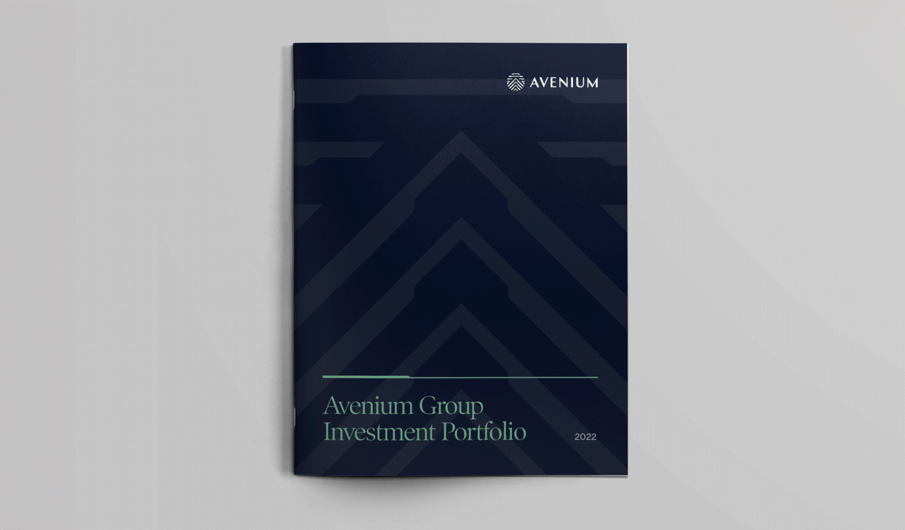
Drawing on the innovation and strength that drives the Avenium team, our designers created a confident and professional primary color palette of deep navy blue and sea foam green.
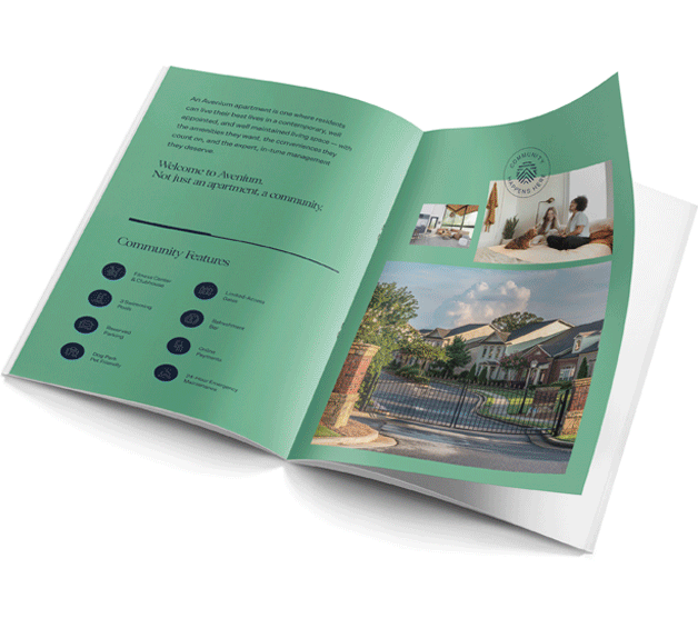
Using the same color palette as the main brand to maximize brand equity, the Avenium Living sub-brand uses sea foam green as the primary color to create a friendly, approachable vibe.
the results
With a confident, fresh, and uniquely relationship-driven identity, Avenium was able to take its place among the industry’s leaders, and confidently communicate the difference they were bringing to the table - the resources, and stability of a larger firm, and the passion and warmth of a smaller private equity group.