Strategy and brand identity for a private label loungewear line
CPG
the challenge
Designed for teens, generation z, and millennial, Buttermint was a breath of fresh air in the world of women’s lingerie and loungewear.
With no pretentiousness at play, their products were cool, comfy, and down-to-earth - feel good in every sense of meaning
While in the past many popular loungewear brands had pitched their products as a way to look flawless, the younger generation was looking for a more authentic pitch.
what was their
next?
Buttermint’s collection was designed to help women to be the best version of themselves- and we were determined to create a brand that would not only sell that, but celebrate it too.
We knew the brand needed to break out of the boxes that most intimate apparel brands fell into - racy, basic, sleepwear, etc., and take ownership of a new category of intimate apparel that was fun, easygoing, and accessible.
The brand’s name was inspired by a smooth little pick-me-up -the delightful buttermint candy. With this name we hoped to give over that sweet experience of an understated little moment of pleasure.
The tone we used throughout the messaging was cool and casual - relatable for shoppers, yet suave and sophisticated enough to have the brand and its lifestyle stand for the ideal version of everyday cool.
the process
We also created fun hashtags that were printed on tape-like graphics and plastered throughout the deliverables for a pop of personality.
Visually, the brand needed to appeal to teenagers and women alike - so while the vibe was definitely youthful, we put an elevated spin on it.
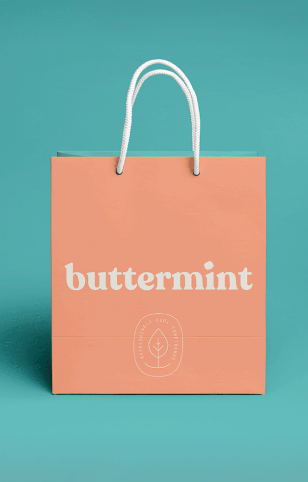
Soft, pastel colors, a mint-leaf inspired icon, and a bold serif typeface formed the brand’s foundation. The buttermint shape took shape in the form of brand tags - the uneven edges adding character and charm.
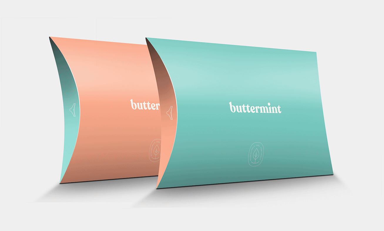
Pillow-shaped packaging was the perfect spot to stash the sweetest product for online shoppers , infusing the brand’s delicious appeal to an often overlooked touchpoint.
Photography was kept fresh, fun, and playful, with the product line’s true-to-life essence apparent from every angle.
the results
Buttermint took shape as a credible, well-defined brand with a distinct, compelling purpose and identity.
Customers felt good about the brand - it was non-threatening and fun. Once they got to that point, it was hard not to fall in love with the products themselves.