Citadel
Case Study
Helping Citadel launch their new brand path forward

the challenge
Citadel Care Centers, a well-known brand in the NYC area, had embarked on a significant phase of growth and transformation.
With extensive renovations underway and an expansion into new locations, Citadel recognized the need to realign its brand message and visual identity to better reflect its evolving operations and enhanced service offerings.


what was their next?
Despite being a trusted name in healthcare, Citadel’s verbal and visual identity did not at all match its portfolio strategy. The existing brand messaging was inconsistent at best, and failed to effectively communicate the full scope of their state-of-the-art facilities and patient-centered care approach.
As the physical transformations took shape, it became clear that the brand’s look and message required a thorough overhaul to match the quality of care being provided.


the process
In a crowded field such as skilled nursing, there are going to be overlaps in the services each facility offers. Significant overlaps. The way to differentiate is by delving deeper into the context within which those services are offered.


Citadel Care Centers are a haven of progressive, forward-thinking care. The strategic partnerships they maintain with local hospitals, specialty programs and clinics, the level of care offered, and the luxurious setting within which they deliver said care, are all driven by one thing: moving the resident forward.
And while every facility has that goal, for Citadel, we zeroed in on their unique philosophy of providing a progressive approach and luxurious accommodations.
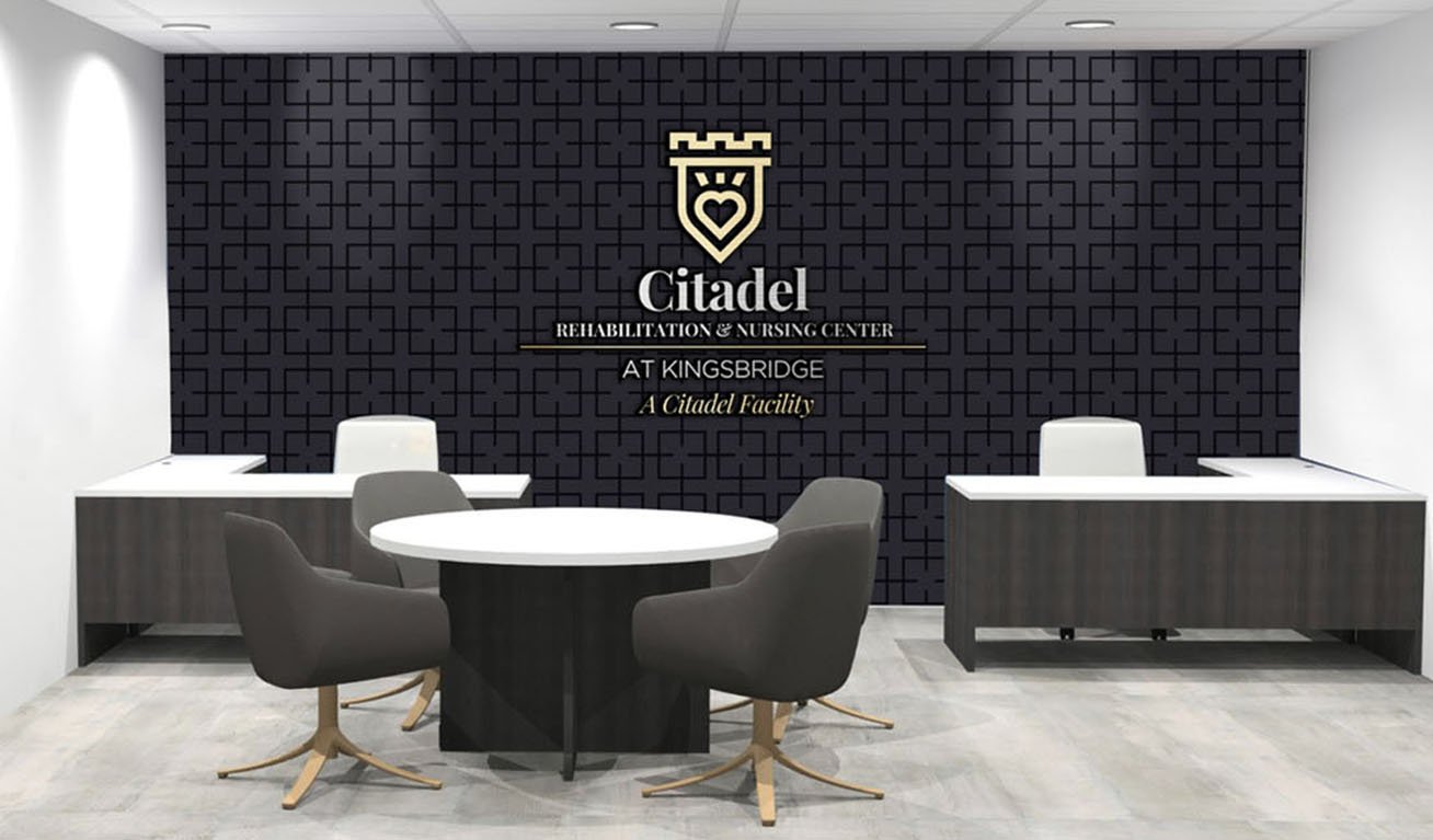
VIsually, we wanted to communicate a sense of modern regality, alluding to this combination of contemporary approaches to care and luxury living.
the results
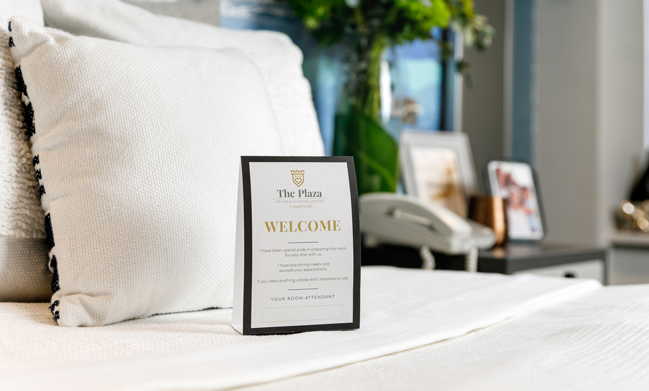
The rebranding was met with resoundingly positive feedback from all stakeholders. Equipped with a unified brand message, a refreshed visual identity, and beautiful marketing material, Citadel has since continued to expand its locations.
