Oasis Healthcare, a New Jersey-based healthcare consulting and management, was acquiring their second portfolio of SNFs, this time in Connecticut.
Known for their ability to improve underappreciated, underperforming facilities, Oasis needed a name, platform, and identity for their upcoming portfolio takeover.
what was their
next?
Similar to our first project with Oasis, the primary goal was to ensure a smooth takeover, inspire confidence in residents and employees alike, keep things as stable as possible, and move forward.
Unlike our first project, however, we were talking to a very different audience. Their first portfolio was based in the Southeast, and required a very gentle verbal and visual feel. (This was especially delicate, because the group was based in the Northeast, where certain cultural and professional expectations and norms were not the case in the South.) Additionally, many of those facilities were severely underperforming.
This portfolio, however, based in the Tri-State Area, and, in some cases, servicing a completely different clientele, needed a more polished, corporate identity. The facilities were not particularly distressed, just in need of some procedural and financial improvements.
the process
Brand first, name second. First establish what you want the brand to stand for, then come up with a name based on those values.
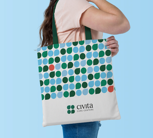
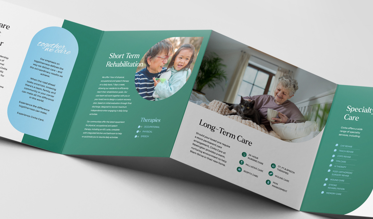
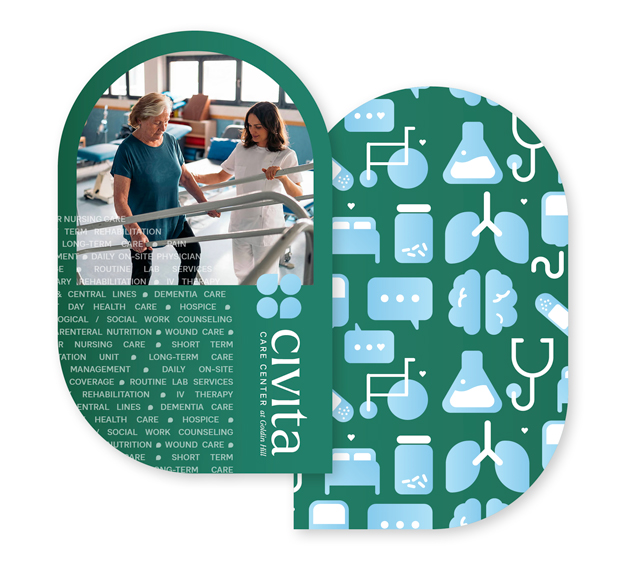
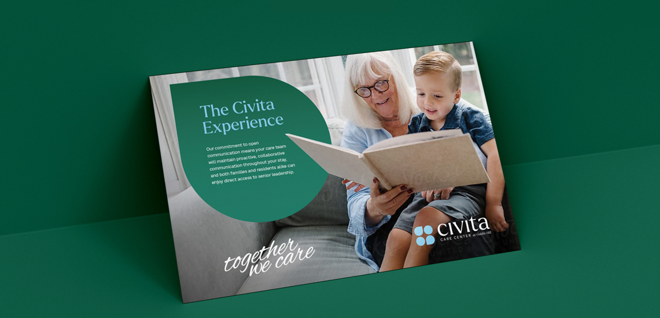
A central theme that came up in our conversations with Oasis was that they wanted to unify the portfolio, both in operation and in narrative, under one brand umbrella. They wanted the brand to stand for unity, expertise, warmth, and efficiency.
This concept of togetherness struck a chord, because it gets at the heart of the matter. The difference between a mediocre or underperforming facility and a thriving one lies in the ability to care together. Together with your staff, together with your residents, together with your community.
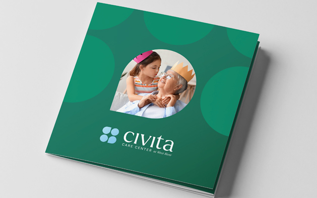
This defined the Oasis approach - and helped guide the naming process. The name we came up with, Civita Care Centers, is derived from the Latin word “civitas”, which means community. It was a more corporate yet approachable name, as per the project objectives.
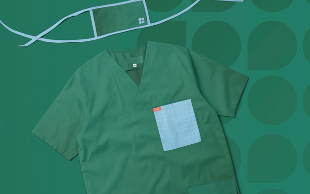
The verbal and visual identity we created hammered home this point, creating a warm, approachable, and most of all highly competent feel.
the results
The response from the facilities was overwhelmingly positive. Inspired by the new owners' positive message and operational support, takeover was remarkably smooth and Civita facilities have been able to continuously improve their quality of care, together.