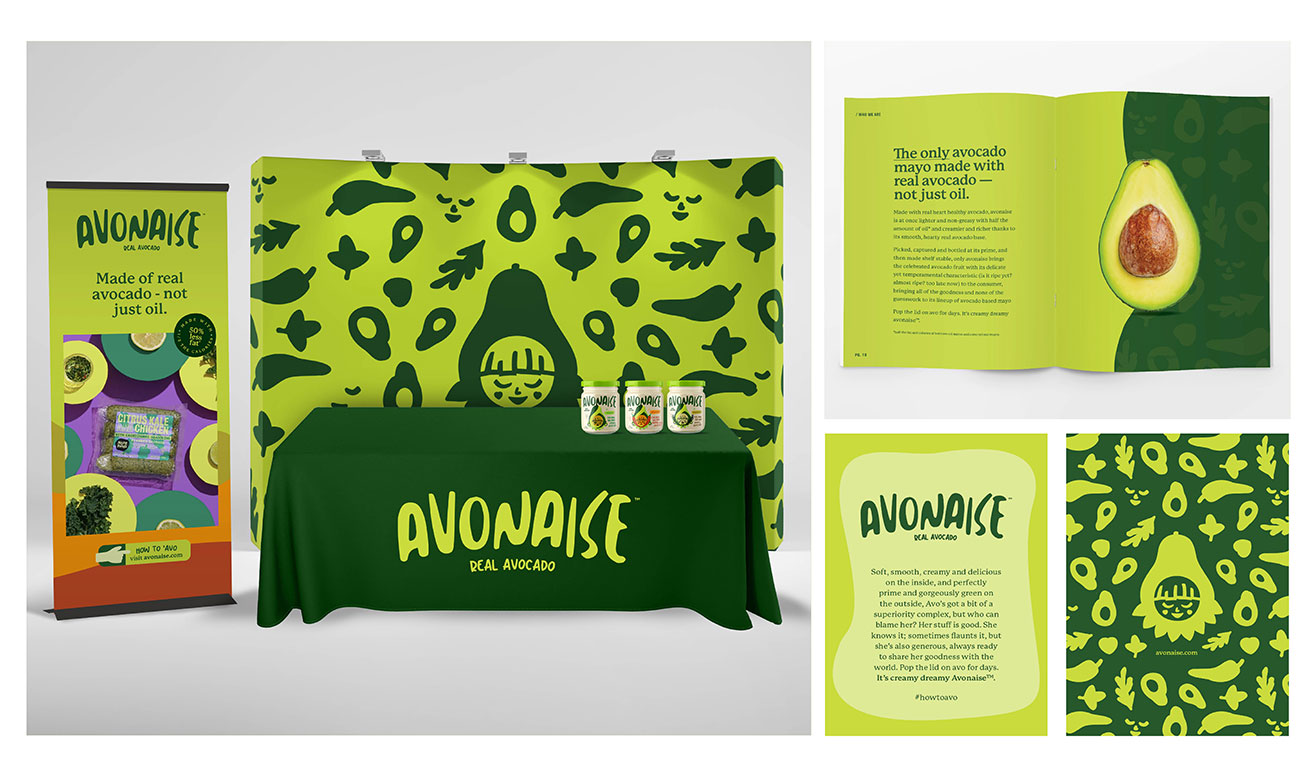
Avonaise
Case Study
A rich brand identity and packaging design for a delicious, heart-healthy, avocado mayo brand
the challenge
We needed to direct health-conscious shoppers to a product they didn’t know existed- a delicious, creamy, heart-healthy mayo.
Beyond that, we were dealing with zero brand recognition and hundreds of other items competing for prime shelf and limited cart space.
what was their next?
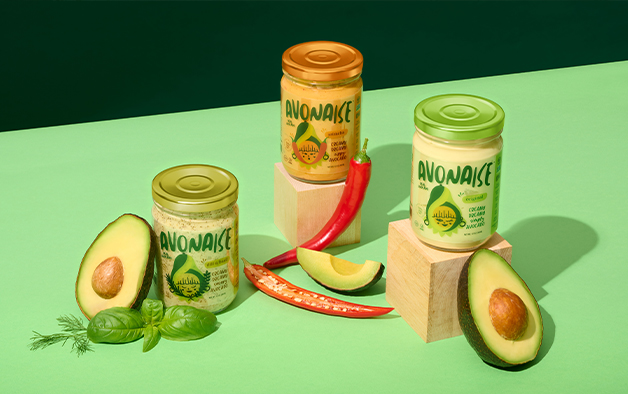
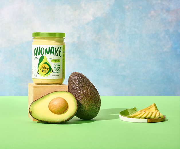
We were tasked with creating a brand that was vibrant and robust, while leaving room for future product expansion.
With a product that was as tasty as it was healthful, we needed to clearly communicate the deliciousness of an all-natural avocado product brought to the jar in all its heart-healthy, rich, smooth, flavorful glory.
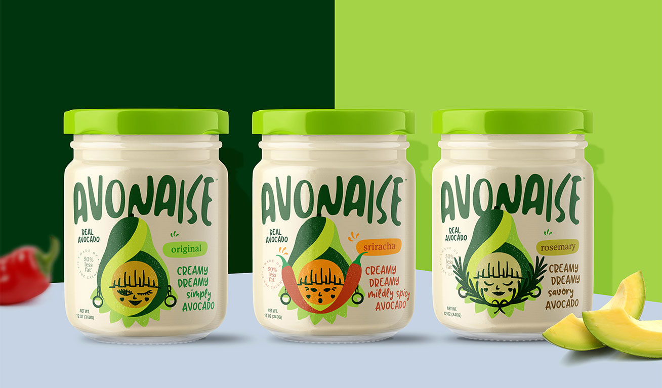
One more crucial factor- beyond standing out in the supermarket, we needed to create a brand that would jump out at product buyers from the hundreds of items vying for limited shelf space at supermarkets around the country.

the process
We needed to meet customers at eye-level- even our product wasn’t placed anywhere near there.
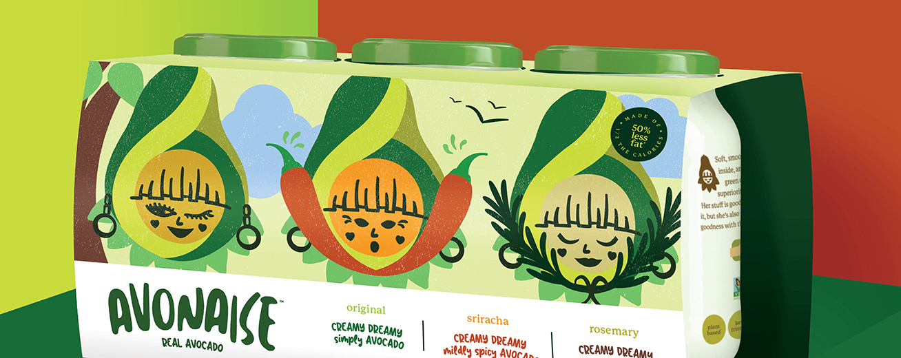
So we used fun, friendly, human messaging on Avonaise’s packaging, shelf materials, social platforms and shipping boxes to draw customers' attention to the brand– and leave them craving more.
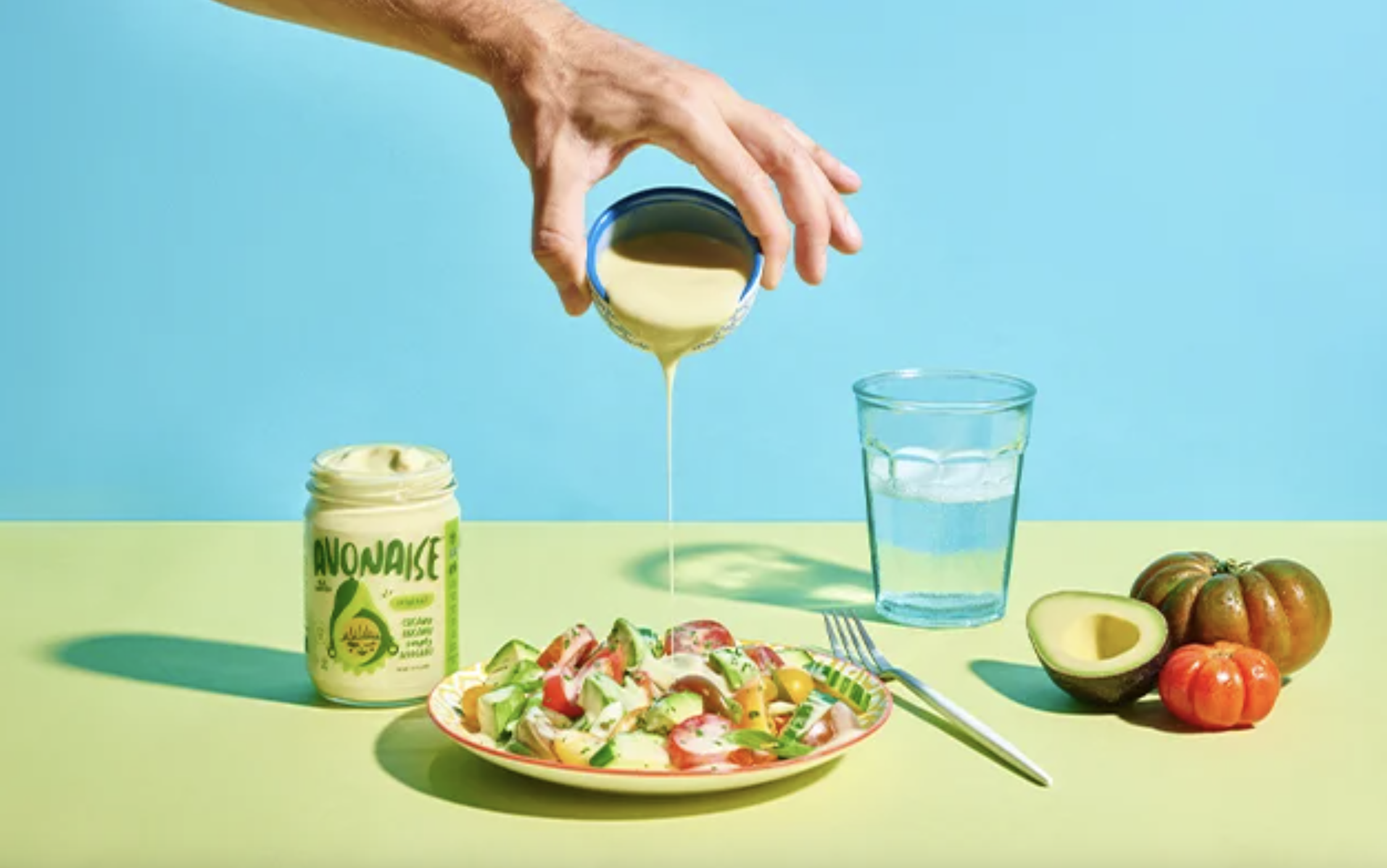
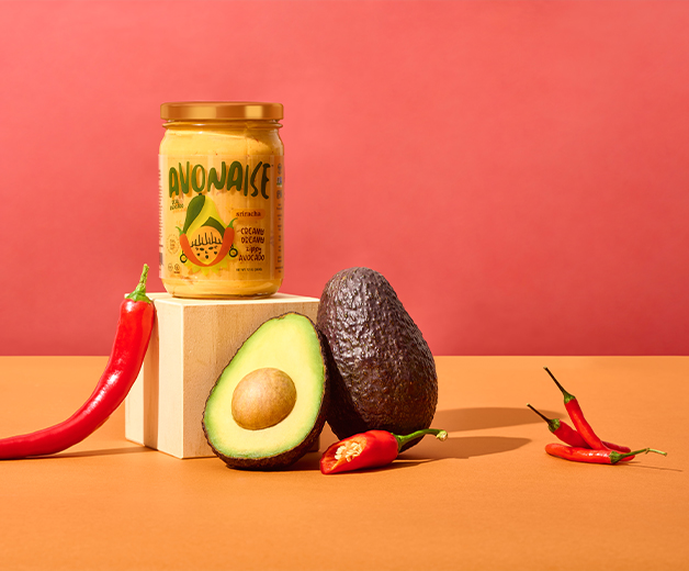
Visually, we wanted this brand to be a celebration of the unique flavor and vibrant colors of the avocado fruit. (Yes, fruit!)
The design team used a color palette inspired by rich green avocado tones, and flowy typography to stir up associations of creamy, dollopy mayo goodness.
Our favorite part of this brand? That would have to be Avonaise’s mascot, Avo. She’s absolutely adorable, and extremely versatile, taking on different facial expressions and adding elements for each flavor.
the results
Firmly positioned as the as the trendy, delicious alternative to traditional, cholesterol-laden mayo, Avonaise’s unique product had the identity it need to stand out at trade shows, on supermarket shelves, and in social media feeds.
