Freedom Bar had the best challenge a client could come to us with.
They had a fantastic product in an exploding category, but their packaging lacked the story necessary to capture buyers’ and consumers’ attention.
what was their
next?
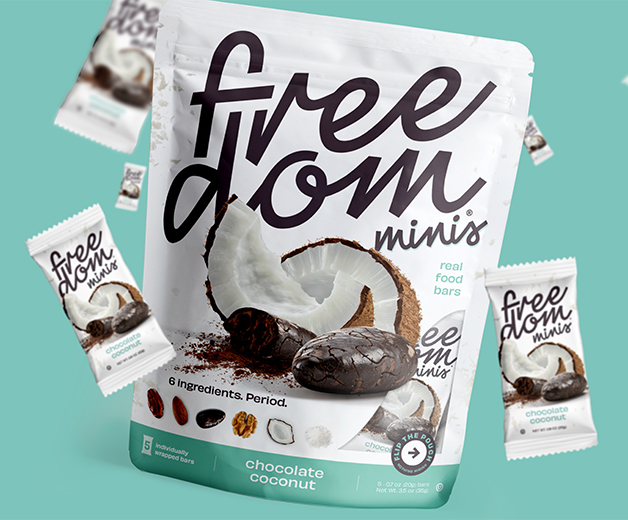
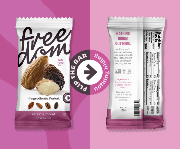
We faced Freedom Bar’s competitors head-on with an audacious front-to-back package challenge (“Flip the bar, nothing hiding”).
By directing consumers to read our ingredient list closely, we invited comparisons to leading brands whose concentrates, extracts, and ‘natural flavors’ from lab-made formulas could be found hiding in the ingredient list on their packaging.
the process
While we had a narrative to run with, Freedom’s existing packaging design was missing the oomph needed to stand out on crowded supermarket shelves.
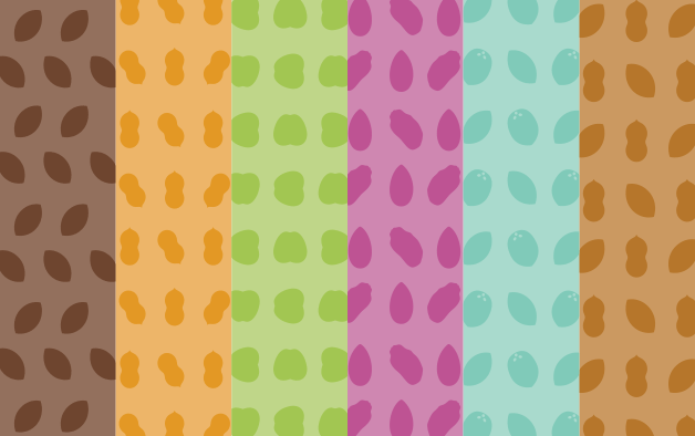
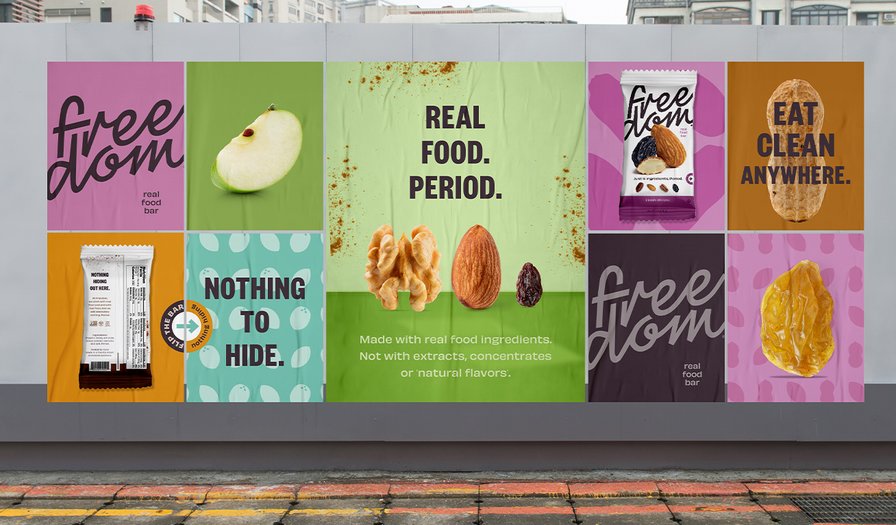
Steering away from been-there-done-that muted color palettes used on competitors' bars, we used bright colors to create an eye-catching, clean, and modern look.
And while the bright colors were there to grab consumers’ attention, bold, hard-hitting messaging told them exactly what they were up against - and the difference that Freedom was offering.
the results
While winning the prestigious MUSE award for our packging design was nice, nothing compared to the feeling of generating incredible results for the brand itself.
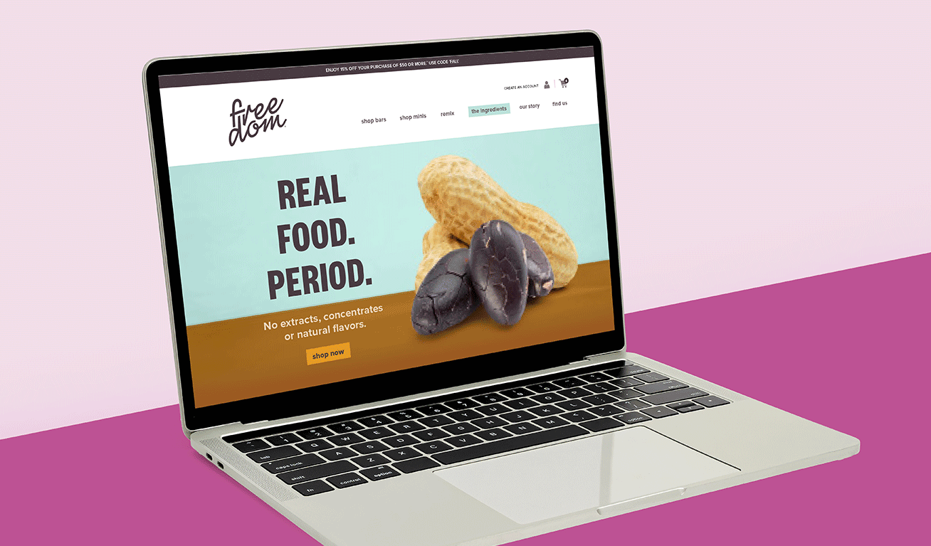
The newly designed packaging enabled Freedom’s products to stand out at national trade shows, grabbing the attention of buyers for mega corporations among a sea of competing products.
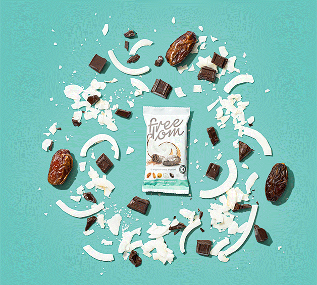
And with a standout look to direct consumers to their product and a bold mission to redefine what a health food bar should offer,
the brand gained a fan club of consumers who were passionate about the transparency (and deliciousness!) that Freedom was bringing to the table.