Gander
Case Study
Strategy and brand identity for a new line of affordable eyewear
Consumer Goods

the challenge
The rise of online glasses brands with their casual, one-size-fits-most model had revolutionized the eyewear industry, allowing a once costly, time-consuming purchase to become a no-brainer.
Gander was competing on two fronts - offering an accessible alternative to the leading online eyewear brands and a more legitimate, appealing alternative to the cheap, undifferentiated Amazon brands.
To accomplish both, we had to create a brand with just the right amount of premium - taking care not to scare the budget conscious, while allowing consumers feel confident in their purchase.


what was their next?
After our in-depth research phase, it was clear that brands in this space need to insist on quality and clarity at every stage. With customers ordering a product that would be worn on their face off a screen, the specs needed to be flawless.

We knew exactly what we wanted the brand name to sound like - easy, light, and very much apropos for the casual online eyewear consumer.
Gander (literally to see) invites customers to have a look at the product line and envision the way our glasses would frame their features, and allow them to put their best face forward.
the process


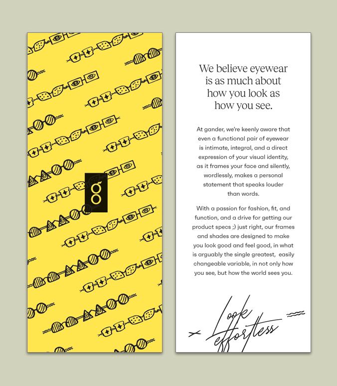
On-point messaging established Gander as an affordable, curated collection of eyewear and accessories. The brand highlighted the a passion for fashion, fit, and function,and a drive for getting product specs just right.
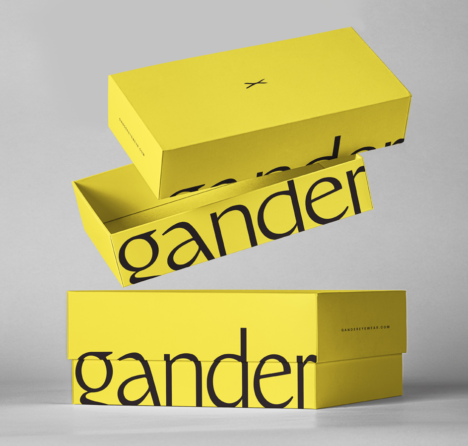
We began the visual phase by creating an understated upmarket aesthetic, subtly enticing consumers to have a look at the brand and envision themselves projecting the effortless confidence of a face well framed and an ensemble well completed.
Combining the letter G, and pair of eyeglasses, the icon mark was the first step in creating a brand that was as effortless as it was elegant.
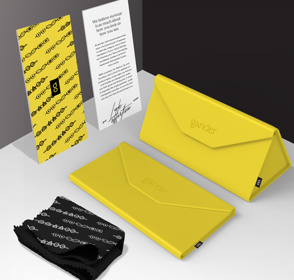
Bold and contemporary, the palette of yellow and black allowed for strong brand differentiation and the perfect balance of upscale and mass-market appeal.
Brand patterns featuring a cool script font and quirky glasses designs created an additional layer of interest to be incorporated across the deliverables.


the results
The brand resonated strongly across the entire spectrum of our target audience -the style conscious, the price conscious, and everyone in between.
Shoppers loved the well thought out branding that allowed them to feel good about their eyewear, and the way they were seen by others.