Golden Estates
Case Study
Brand identity and naming for a new 55+ residential community
Real Estate
the challenge
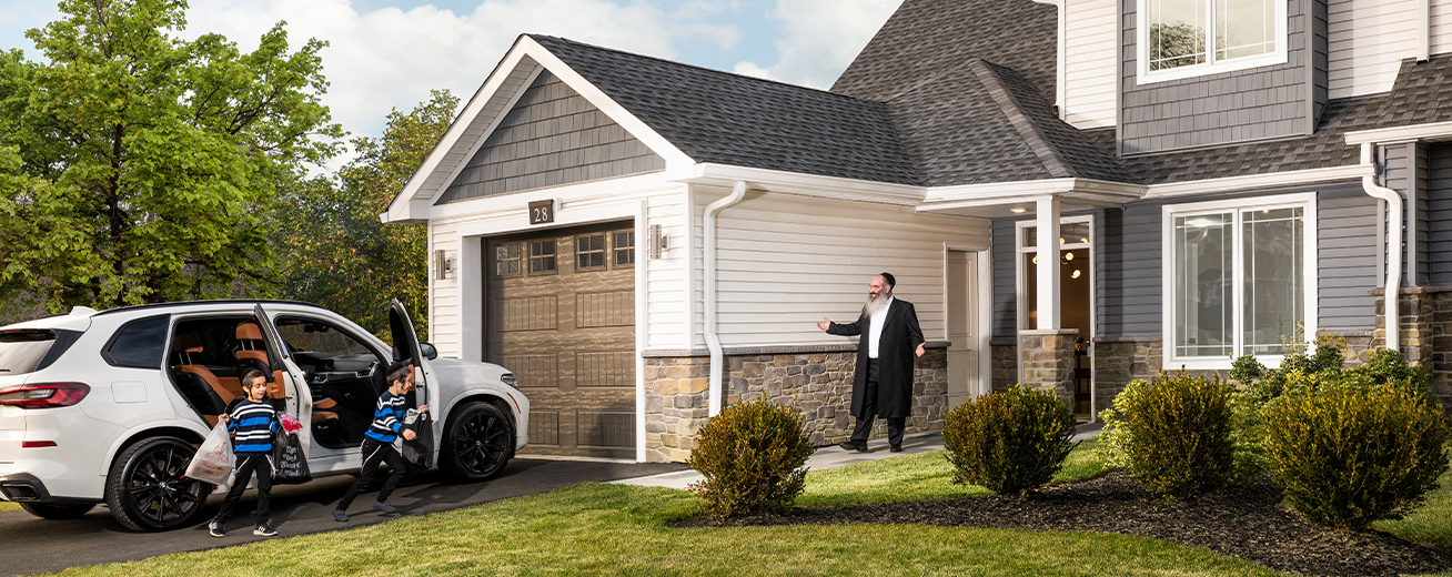
To attract potential buyers, we had to create a compelling brand that represented the essence and features of this senior living project while effectively appealing to and engaging the Chasidic community.
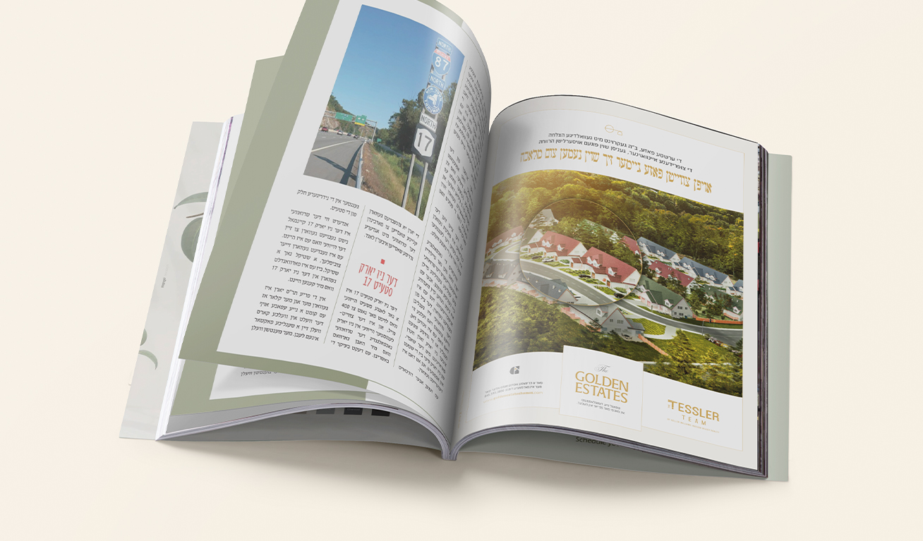
Additionally, a large percentage of the target audience did not speak English as their first langauge, so the rebranded identity (specifically the name) had to be easily pronounced and written in Yiddish to foster an environment of comfort and familiarity.

what was their next?
By creating a culturally relevant brand, we brought something entirely new to the market — a community that was tailor made for the needs and preferences of the Chasidic community.
The messaging had to highlight specific features aligned with and geared specifically to the target audience’s cultural values, as well as the standard amenities that were expected in a 55+ community.
the process
The name "Golden Estates" conveys a profound sense of honor and respect for the esteemed senior members of the Chasidic community. With this name, we established the project’s commitment to cherishing the legacy and wisdom of its residents, fostering an environment of mutual admiration and appreciation.
The messaging throughout the brand further reinforced that respect, while setting the tone for lifestyle of luxury and tranquility - of golden years well lived.

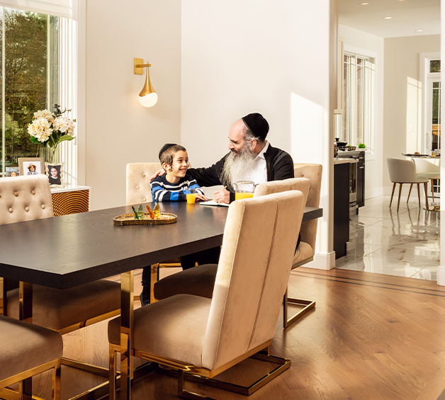
The design evokes a sense of modern grandeur and prestige, aligning perfectly with the community's vision of offering upscale and luxurious living spaces.
We used golden hues and elegant typography to convey a priceless atmosphere, with imagery to portray this serene haven where residents could bask serenity of their surroundings.
the results
With a new name and brand identity that encapsulated the core values, vision, and essence of this 55+ community, we enabled potential residents to connect with the project and envision it as their ideal living space.
