Ichud
Case Study
Rebrand and strategic positioning for Brooklyn’s foremost integrated education program
Nonprofit

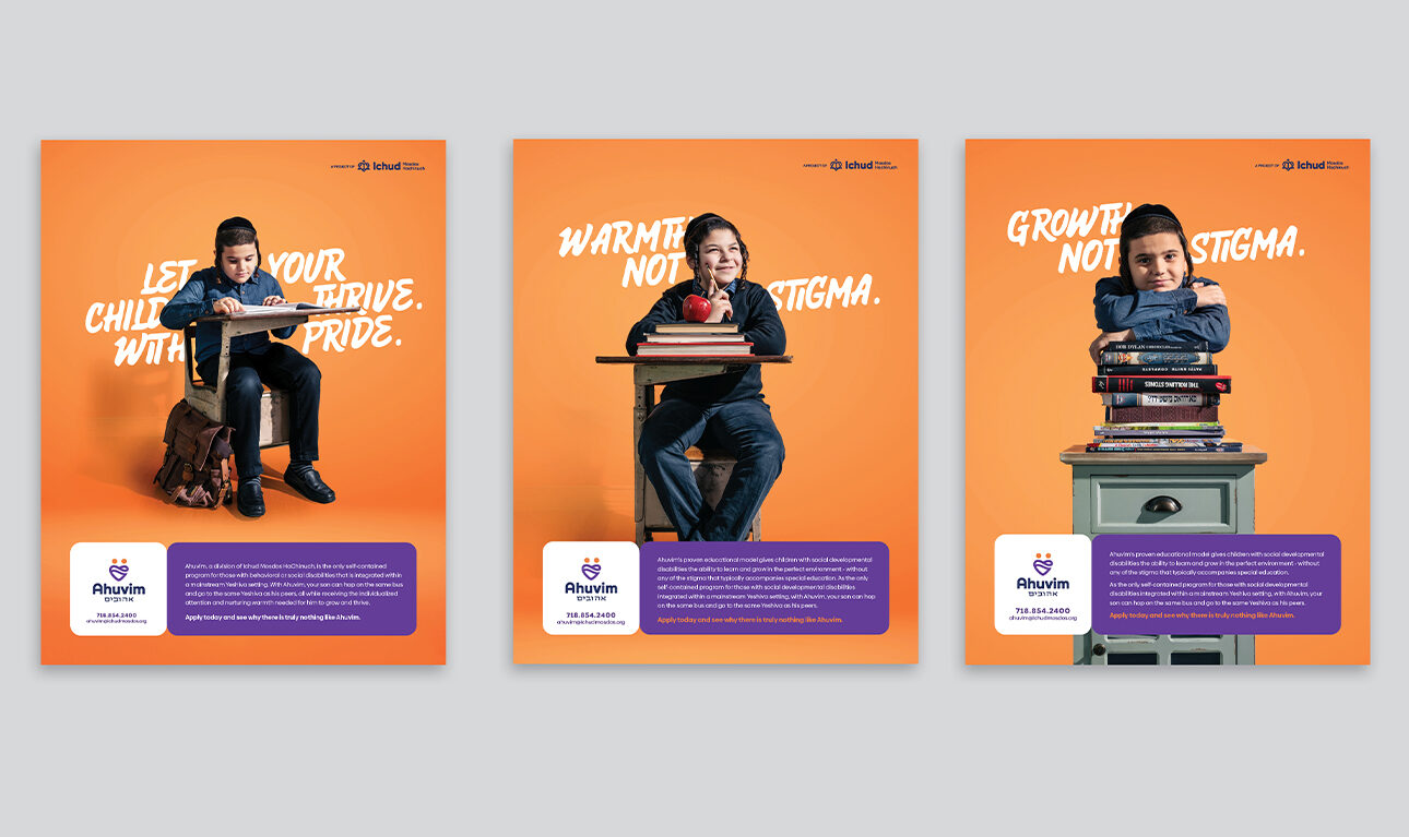
Ichud’s mission is to provide the perfect environment for those with learning or social differences to learn and thrive - while minimizing the stigma associated with specialized education.
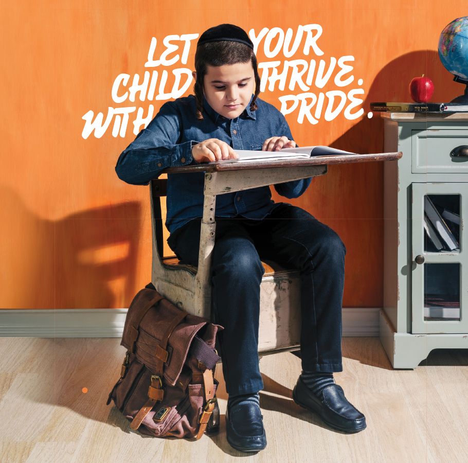
Housed within local host schools, Ichud's programs enable their students to attend the same schools as their peers, allowing them to get the services they need without standing out.
the challenge

Amidst a rise in special education programs and services in the region, community members were left confused about the differences between them all. The subtle, yet crucial distinctions between each one were very much there - and Ichud needed a way to communicate that.
We needed to give Ichud a bold position that would differentiate their offering from the outset, leaving no question as to what the program was.
what was their next?

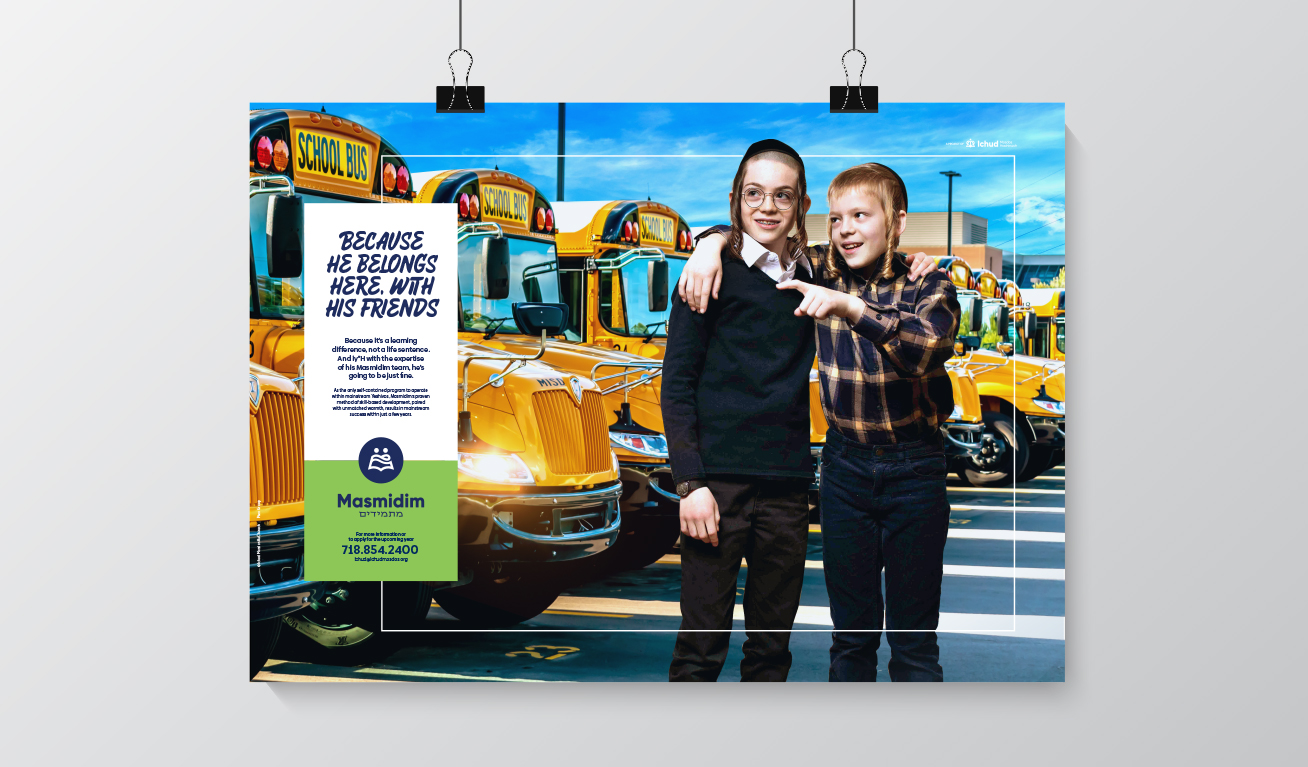
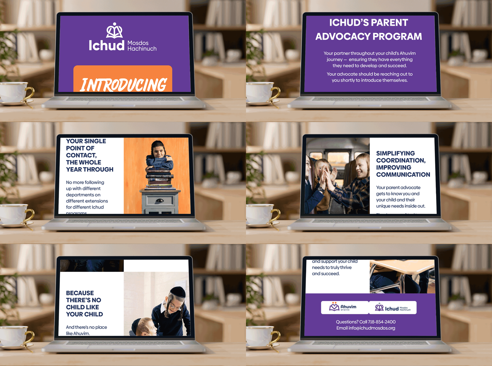
We united Ichud’s services around their mantra and tagline of “there’s no place like Ichud”, furthering the conversation through marketing materials that Ichud’s programs in detail.
Messaging emphasized the sense of belonging that Ichud promotes, with warmth and positive vibes resounding throughout the informative content.
the process
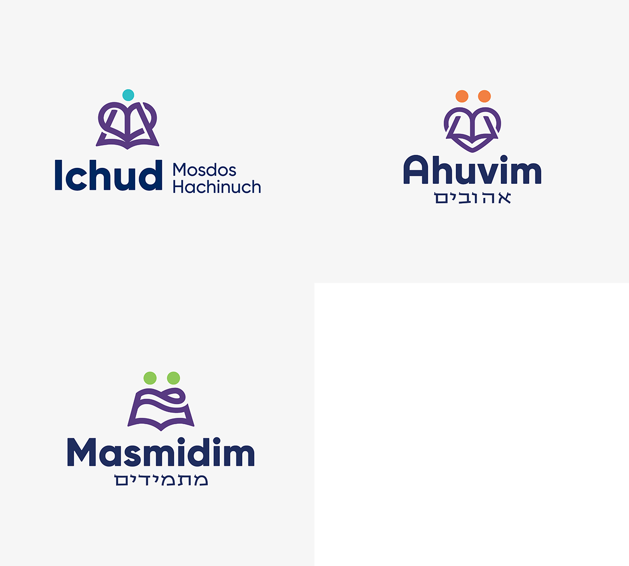
Comprised of a heart shape, a child, and a book, the geometric logo lends itself to interpretation and various applications, with the bold typeface keeping the Ichud name front and center.
The sub-brand icon marks are derived from the primary logo, each designed to highlight the program’s specialty.
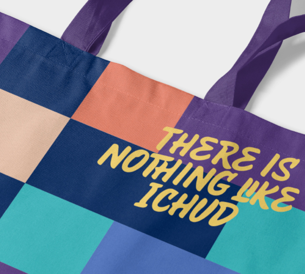
The bold, serif primary typography is offset by a funky, marker-inspired typeface used for headers.
The cheerful color palette and colorful iconography speak to the brand’s kid-centric approach.
the results
Through their refreshed branding and solidified positioning, Ichud was able to bring their mantra out into the mainstream, letting more people know that despite the abundance of programs and services for those with disabilities, there truly is no place like Ichud
