Isaac Westman
Case Study
Strategy and brand identity for a luxury jewelry brand

the challenge
For over 40 years, the Isaac Westman team designed jewelry for major U.S. retailers. They saw an opportunity to leverage their expertise to create a flagship brand featuring a curated selection of timeless jewels, proudly bearing their name.
The goal was to develop a brand that felt modern yet timeless, competing with established names.
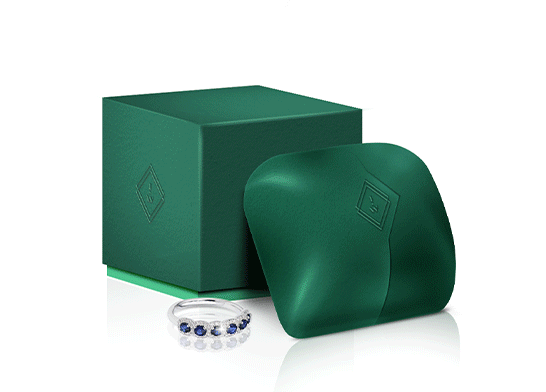
what was their next?
Beyond creating beautiful designs, we knew the Isaac Westman brand was one that would go to the ends of the earth to bring out the beauty each metal and gem had to offer.
That spark, and sense of adventure infused all their designs with a spirited element - and would be a central theme throughout the brand.
the process
We kept the brands’ voice and tone sharp, confident and aspirational. The verbiage was compelling and clear - a step above eye level, yet firmly within reach.
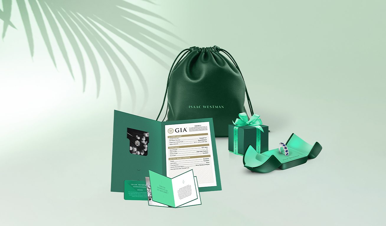
We aimed to enhance every customer touchpoint, making their purchase feel intriguing and exciting. To immerse them in the Isaac Westman experience, each premium purchase included a mini brochure detailing the jewelry's origins and craftsmanship.
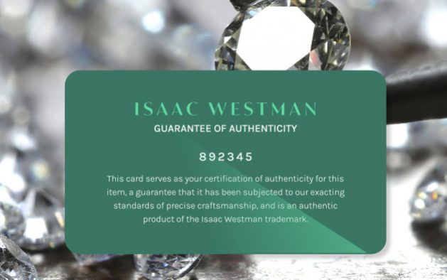
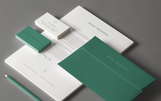
Simple, modern, and sophisticated, the wordmark exudes luxury, with the typeface’s thick & thin strokes adding a classic feel.
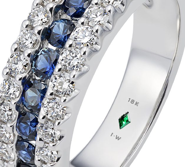
We combined elegance with a natural feel using a color palette of two complementary greens. The rich emerald green featured a genuine emerald motif embedded in each piece of jewelry. Soft, dramatic photography added an alluring, vintage look that kept the focus on the jewelry.
the results
We created a brand experience that’s a pleasure to give and a joy to receive.
With a richly defined brand platform, we enabled customers to express their deepest sentiments in a tangible way, simply by choosing their favorite of the brand’s meticulously crafted pieces.
