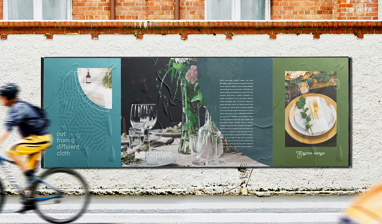
Naptec
Case Study
Strategic positioning and rebrand for a parent brand + four subbrands

the challenge
Naptec manufactures and sells high-quality disposable napkins and tableware. Since launching their flagship line BloominGoods in 2016, the company had grown tremendously, expanding their product line and launching three additional brands: Lintext, Servietto, and Naperee.
Although sales were strong, Naptec was missing a cohesive brand system -- which meant there was no framework in place for new content and deliverables as the brand expanded.
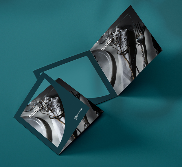
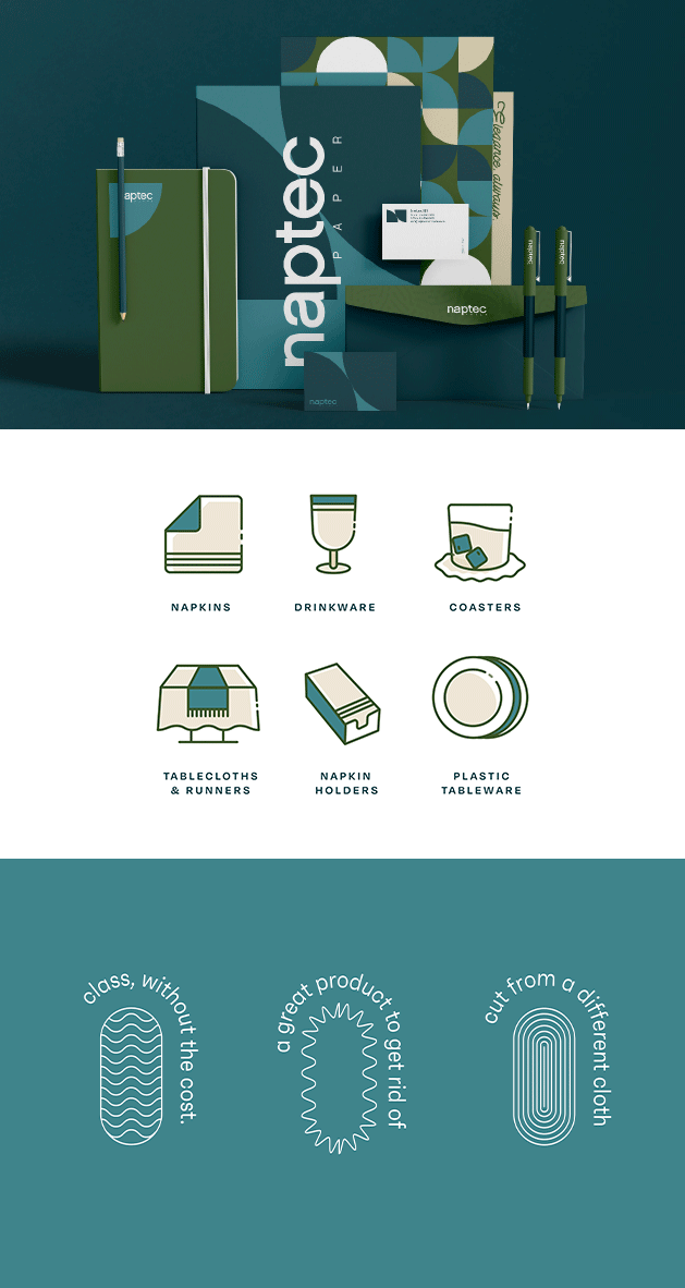
what was their next
As a house of brands, Naptec’s mission would serve as the premise for each of their sub-brands. Once that platform was established, the product content could be created and adapted as necessary for e-commerce and wholesale markets.
Our vision was to establish Naptec as the champion of budget-friendly elegance. In doing so, we tossed a generic narrative and turned the spotlight on the brands’ unsurpassed elegance, affordability, and hassle-free style.

the process
For the branding to resonate, we needed to find the common thread woven throughout a wide target audience that included hoteliers, restaurant owners, and at-home hostesses – and we found it.
Our audience were thoughtful people, the kind who’d go the extra mile for their guests, knowing that a memorable experience is defined by special touches.
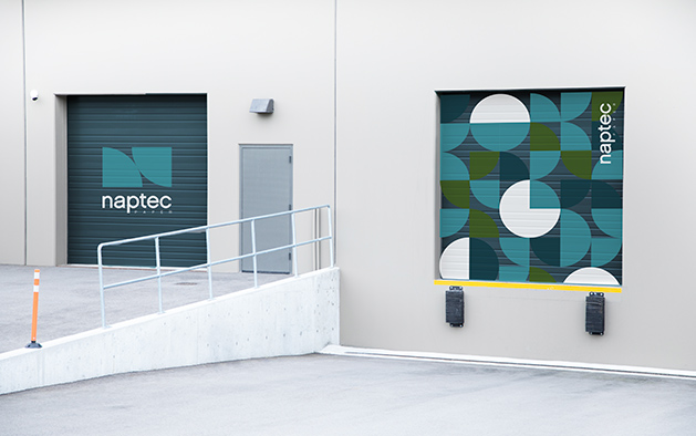
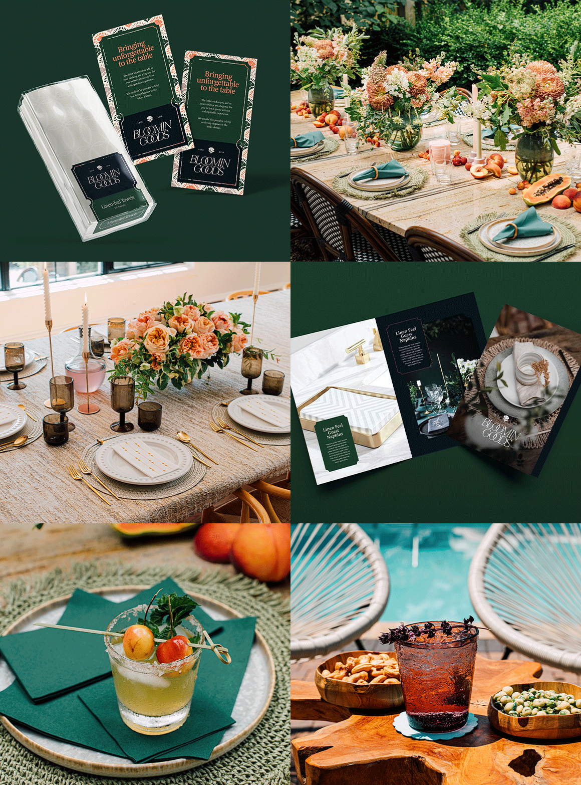
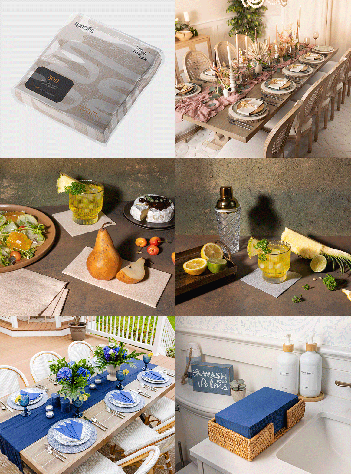
Within this framework, we created a distinct identity and tone for each of the sub-brands. BloominGoods, Lintext, Servietto, and Naperee had their own strengths, and the visuals and messaging for each one leaned into them.
As the flagship brand with the largest product line, the Bloomingoods brand needed to feel established, yet exciting and open to new possibilities. A script logo mark kept things classic while bright colors and a splatter inspired pattern gave the visuals a fun twist.
The Lintext branding focused on the soft, smooth linen-like feel of their napkins. We used a muted color palette and wispy, featherlike graphics to reinforce the message that these disposables were as delicate to the touch as genuine linen.
Naperee’s branding narrowed in on their reputation as leaders of the fold. We infused a touch of the brand’s signature flair into the logomark by adding a flourish to the “N” and “R”. Clear iconography highlighted Naperee’s unmatched quality, drawing attention to features like thickness, design and absorption.
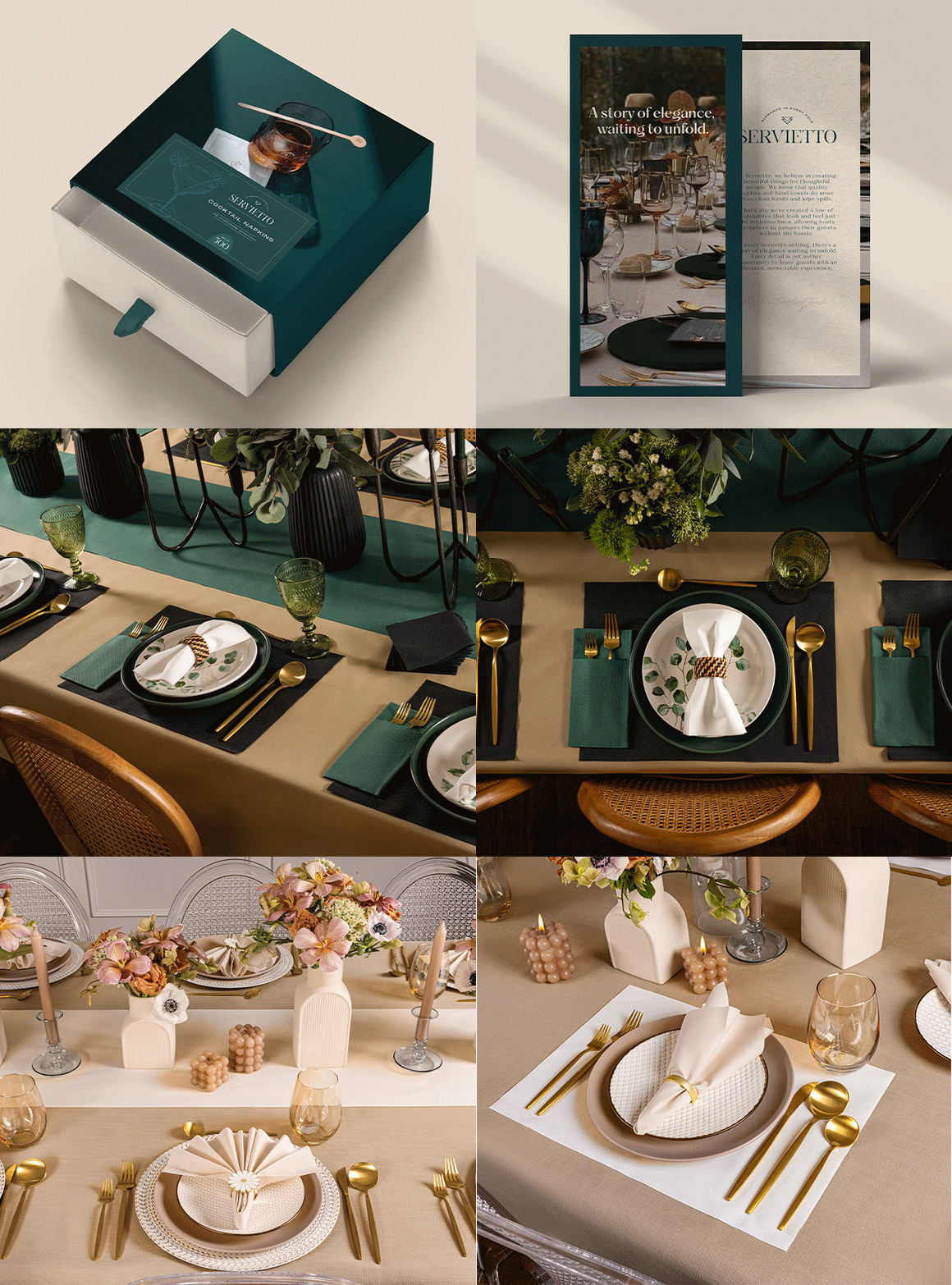
Classically inspired, Servietto’s branding emphasized elegance. From the serif font used in the logomark, to the intricate sketches of the products’ uses, the visuals told a story of a clean approach to thoughtful detail.
the results
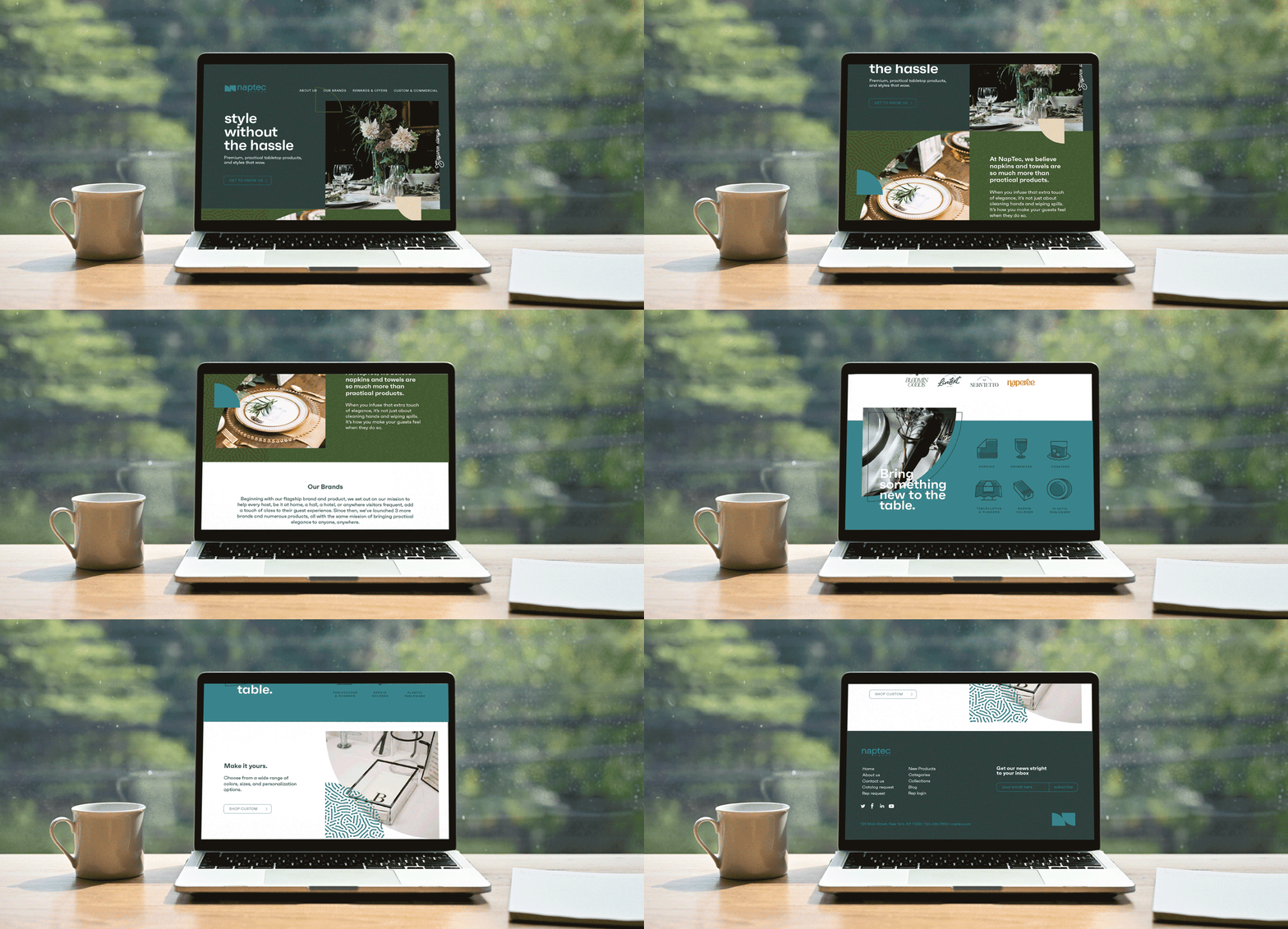
Verbally and visually, we created a robust brand platform that gave each sub-brand a distinct identity, while unifying and solidifying the Naptec brand as a whole.
And regardless of the size and scope of their event, we gave customers the opportunity to leave an unforgettable good impression. What could be more powerful than that?
