Rebrand for a workload management and outsourcing solutions provider
B2B Service
the challenge
WIth so much on their plates, business owners (and their best employees) had no time for brainless repeatable tasks.
While overseas outsourcing would have been the obvious solution, explaining tasks to someone sitting halfway across the world was usually a bigger headache and hassle for all those involved.
As a result, even the most savvy, streamlined businesses found themselves backlogged with work that anyone could have been doing.
Offload offered businesses a novel solution – a customized, foolproof (literally!) breakdown of their repeatable tasks which was then outsourced to vetted, capable teams.
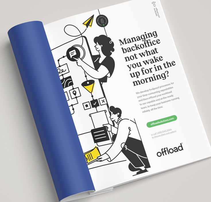
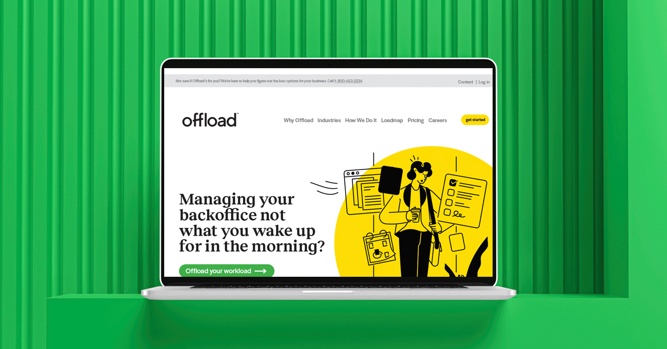
But with many businesses burnt by previous attempts at outsourcing, Offload needed to address concerns from the outset, drawing attention to their service for being the painless, stress-free, and seamless solution that it was.
what was their
next?
The brand had to leave business owners with no doubt that this was a solution they could set and forget- and fully rely on.
To do that, we had to proceed with caution – and with confidence. Because while Offload’s brand needed to reflect their identity as a professional service provider, maintaining a straightforward, down to earth and personal tone would be a crucial way for the brand to build trust.
As an outcome provider, not a workforce provider, Offload was unique. We worked closely with their team to build a brand that reflected their methodical, clearcut approach to outsourcing.
The focus here was two-fold - making sure customers understood how things would get done, and in turn, what that would do for them.
We worked to highlight the fact that Offload enabled business owners to sidestep the attendant challenges of offshoring + outsourcing while enjoying the outcomes they needed to keep their businesses running smoothly,reliably, and cost effectively.
The vibe throughout the visuals was modern and corporate, with a fun, friendly, human twist.
the process
The vibe throughout the visuals was modern and corporate, with a fun, friendly, human twist.
We designed the wordmark with an emphasis on clarity and simplicity, the line running through the two letter “f”s conveying an upward trajectory.
We created the brand’s minimalistic icon mark by reducing the wordmark to the letter “O”, with the same upward slash alluding to the empowering and efficient offloading process.
Bold and cheerful colors reflected the brand’s can-do attitude, while geometric shapes and arrows formed the basis of the distinctive brand patterns.
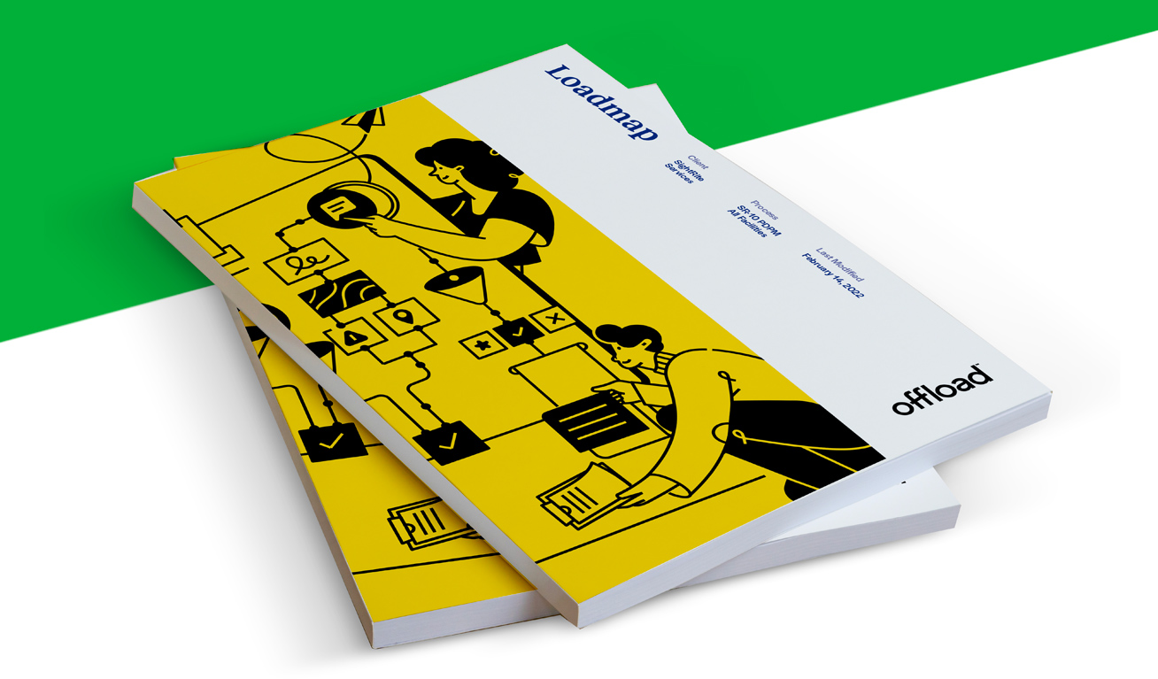
One of the main deliverables we were creating for Offload was the Loadmap - the codified, streamlined and then outsourced workload they provided their clients with. We focused on getting each design element to work seamlessly, allowing the Loadmap to be visually engaging, yet simple and clear to follow.
the results
The brand married predictability and precision, with a recognizable pop that highlighted the human interaction and oversight Offload was offering every step of the way.