Peace of Mind
Case Study
Rebrand for a commercial real estate insurance provider
B2B Service

the challenge
Peace of Mind, a mid-sized insurance provider specializing in real estate coverage, was in need of a brand that conveyed their USP — their ability to broker a true relationship with every client.
The brand was competing with providers on two levels – the large-scale firms with robust infrastructure, and the boutique brokers offering a more personalized experience.


what was their next?
To place Peace of Mind ahead of the pack, we knew we had to hone in on their specialty – the area of expertise that would have clients choosing them over the big guys, and then the various smaller firms.
the process
Following an in-depth examination of the firm’s culture and practice it became apparent that the Peace of Mind team was comprised of insurance experts who truly cared about their clients’ success.
They had the know-how to navigate every coverage challenge — which in turn offered their clients endless peace of mind.

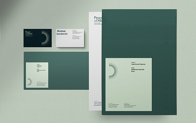
The logo mark was created to give off a radiant, bright energy, while directing focus to the wordmark.
The color palette of muted green tones aligns with that natural, feel-good energy, while fitting in with the corporate environment.
Elegant serif fonts lent an established, timeless feel to the brand, complemented by a suit of icons to keep deliverables easily scannable.

the results
The new identity conveys Index Ventures’ personal approach and customer-centric mission. The striking visuals and empowering messaging clearly reflect the firm’s strengths- we’d call that a success.
