When it comes to healthcare, human connection is a huge component of patient satisfaction.
Both physically and emotionally vulnerable, POD’s target audience - comprised of the elderly and individuals with chronic illness were hesitant about the idea of receiving virtual care.
what was their
next?
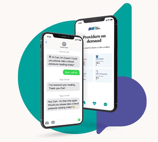
In order to dispel fears of a distant, impersonal telehealth experience, we needed to firmly position POD as a caring, human, and relationship-oriented brand.
A brand that delivers virtual services - but with warmth that patients could feel across every touchpoint.
the process
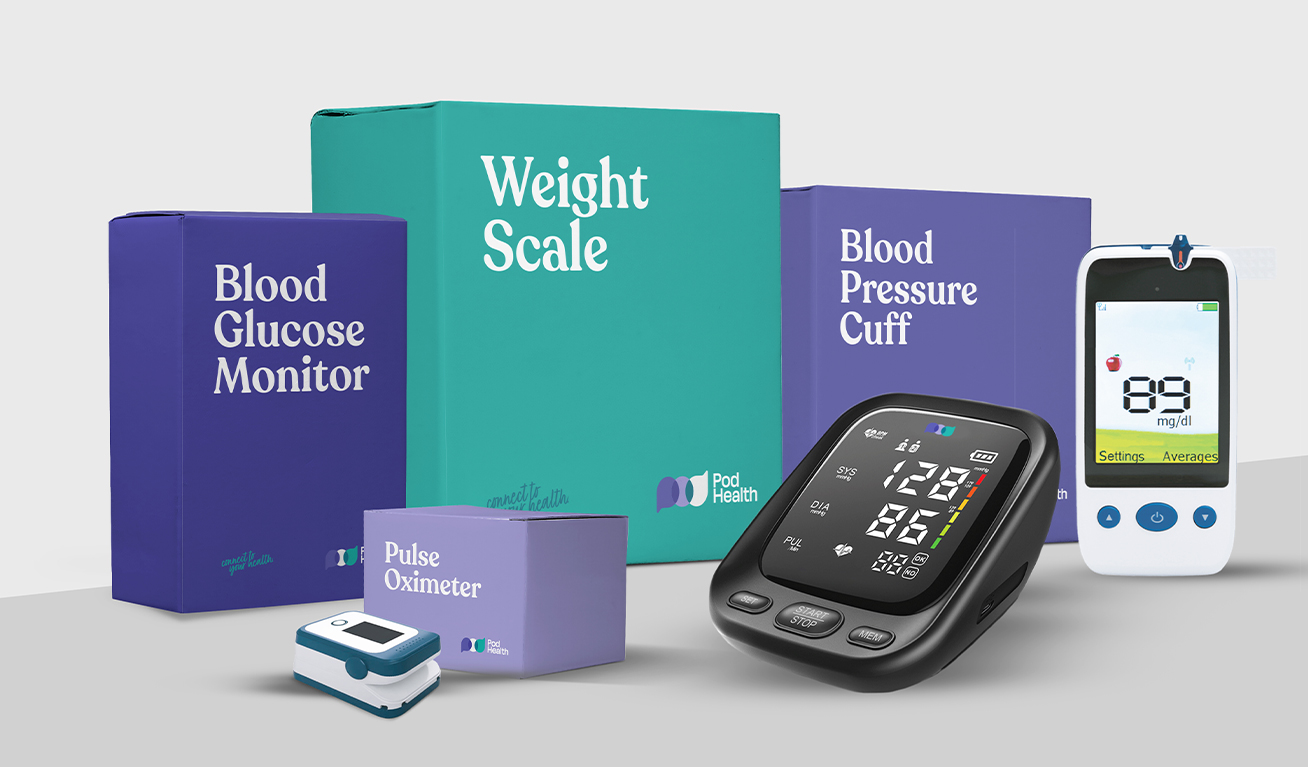
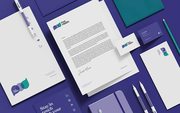
Using sleek typography, and clear iconography, we created a modern visual suite that reflects POD’s cutting-edge technology and ease of use.
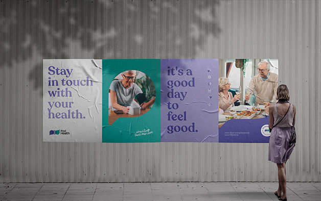
We used vibrant, inviting photography to illustrate POD’s simplicity, convenience and personalized approach.
Terminology throughout the brand messaging showed that POD’s providers knew their stuff, but by using a friendly, human tone we showed that above all else, they know their people.
the results
From the start, the brand was embraced by patients and their families. Within a few months of the brand launch, their company was succeeding and expanding at a steady rate.