Rosemary
Case Study
Brand identity for an upscale Williamsburg supermarket

the situation
As a new supermarket seeking to enter the Williamsburg market, Rosemary was entering a playing field saturated with top players.
Shoppers in Williamsburg were highly discerning, with years of experience shopping in beautiful stores with a wide selection, bright aisles, and delicious takeout.
To stand out among the rest, we needed to take Rosemary above—and beyond.

our take
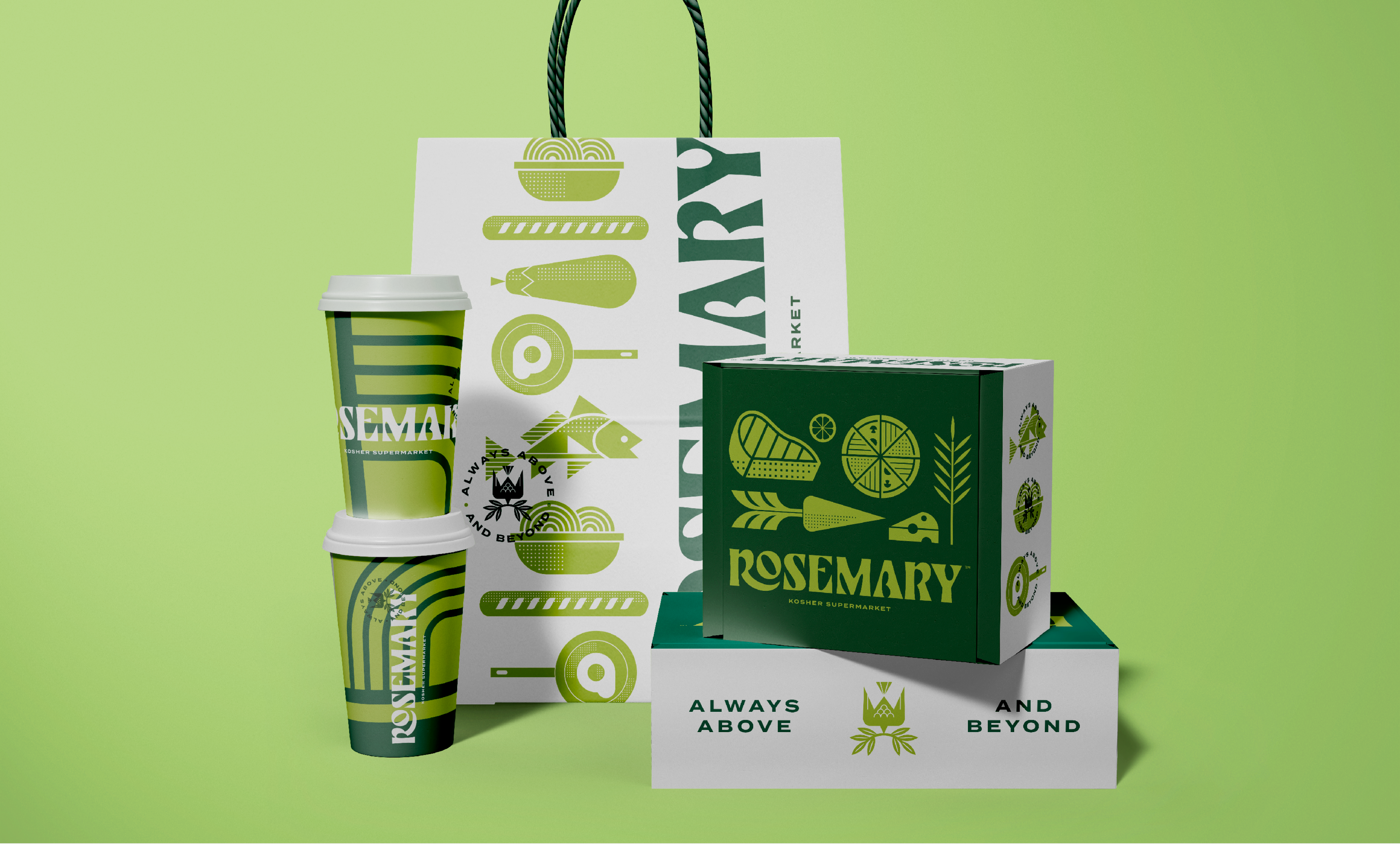
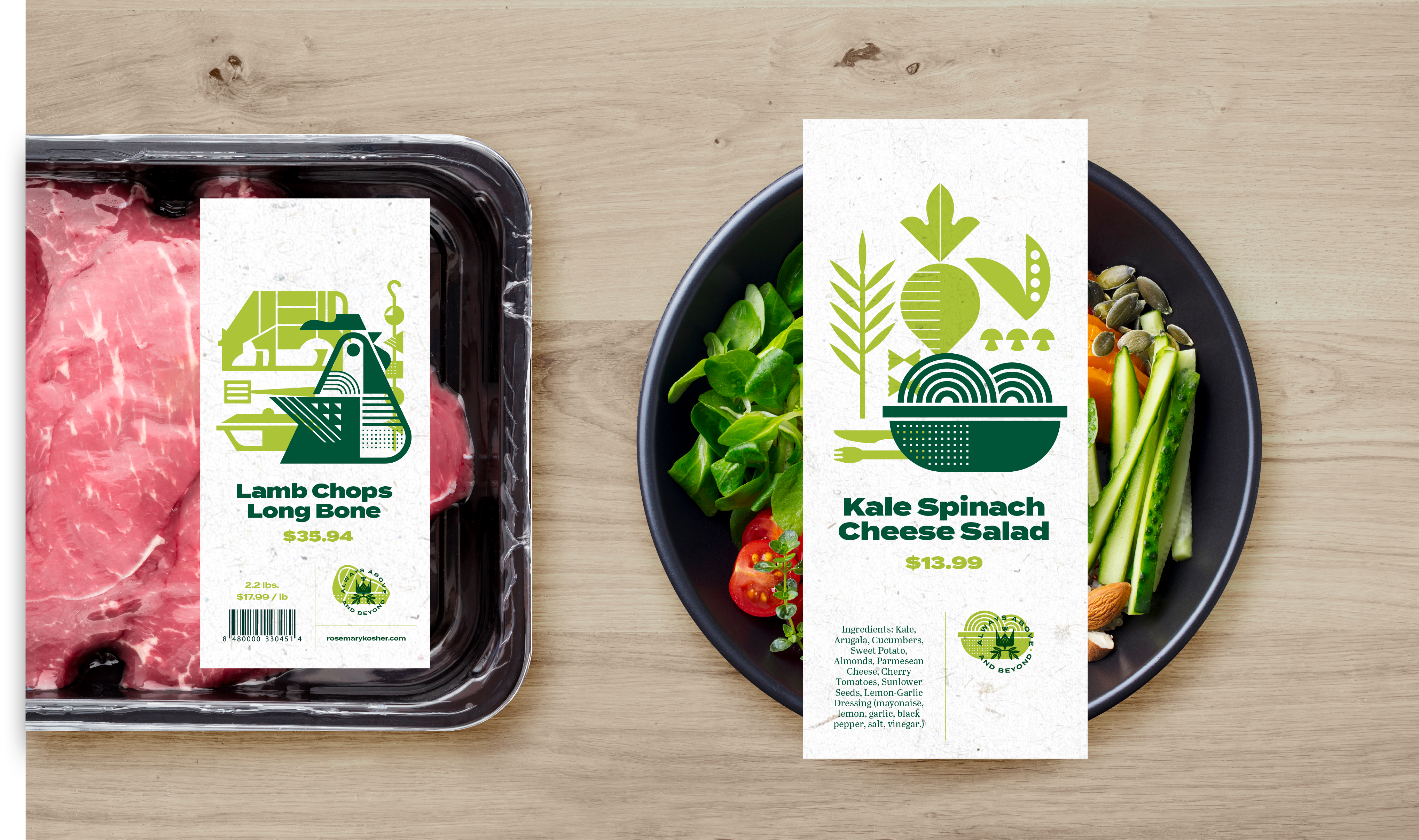
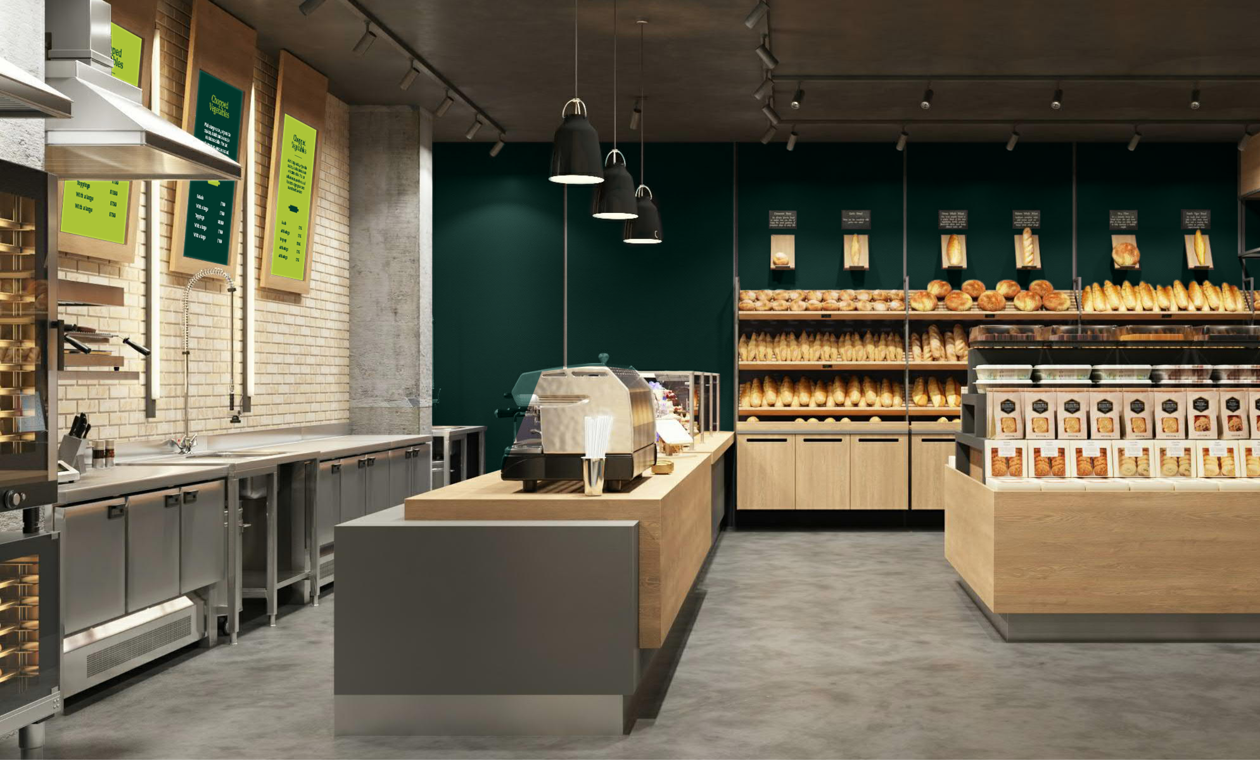
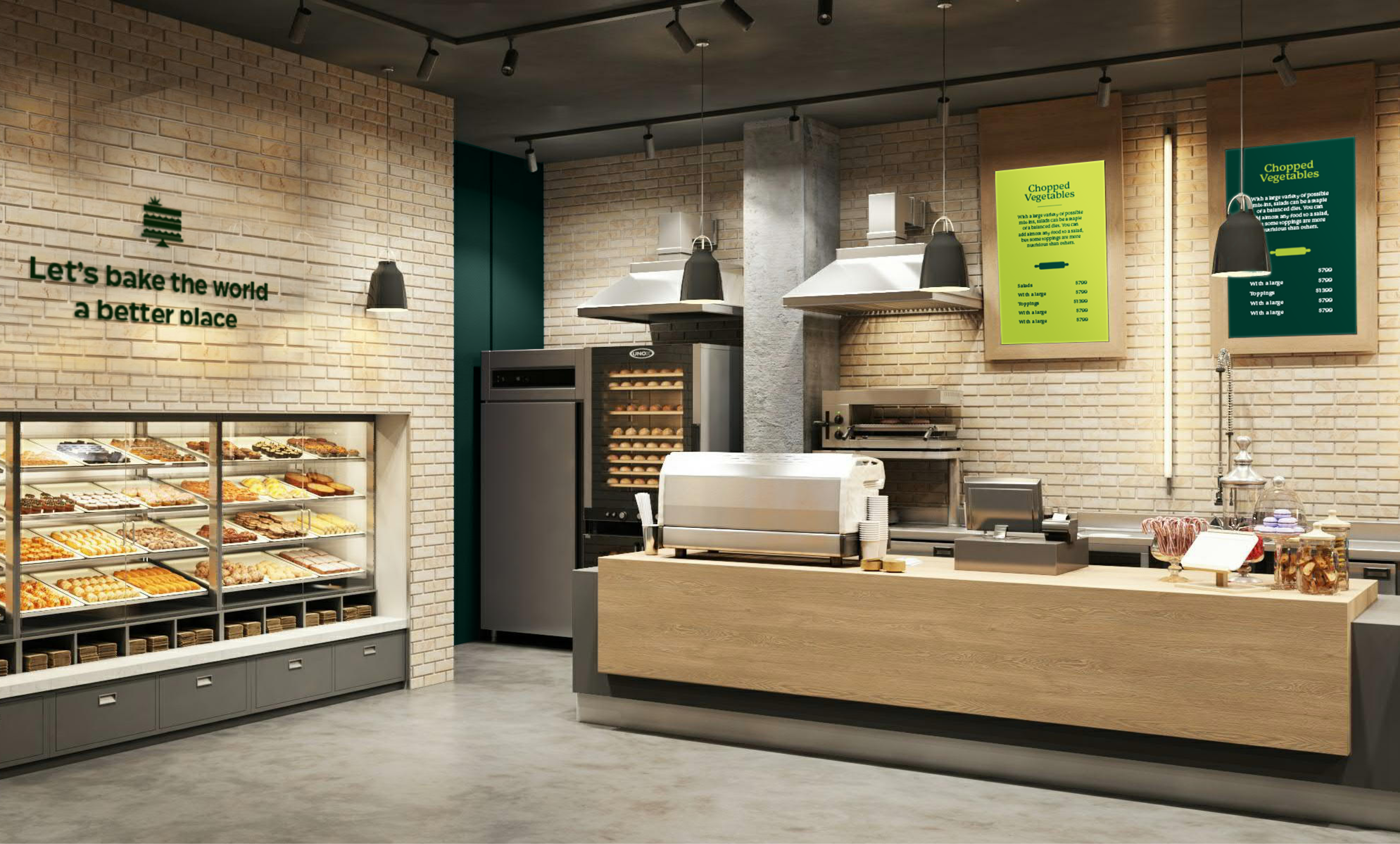
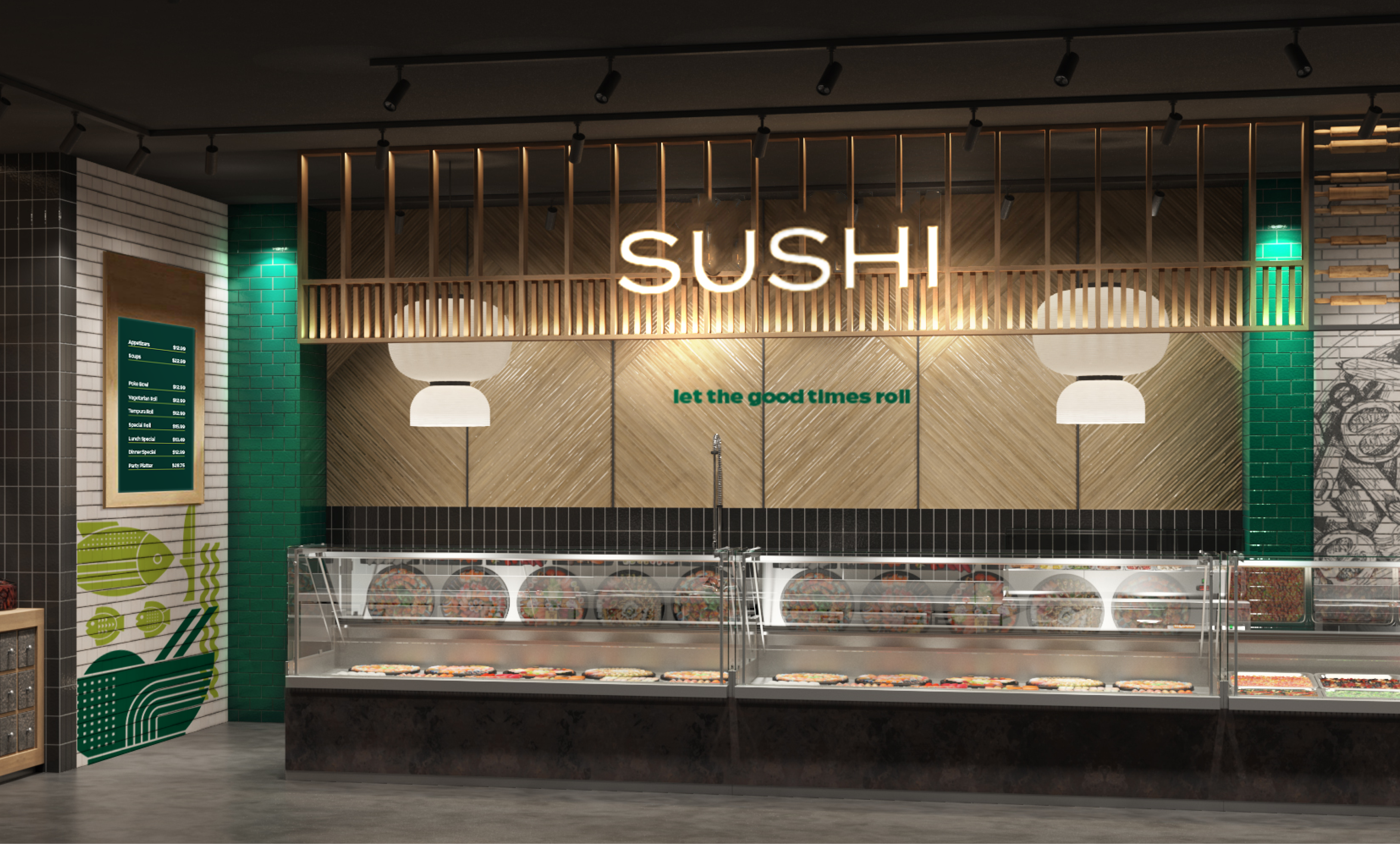
We raised the bar, branding Rosemary as a supermarket that offers impeccable service, absolute cleanliness, and gorgeous amenities at a level previously only delivered by the hospitality industry.
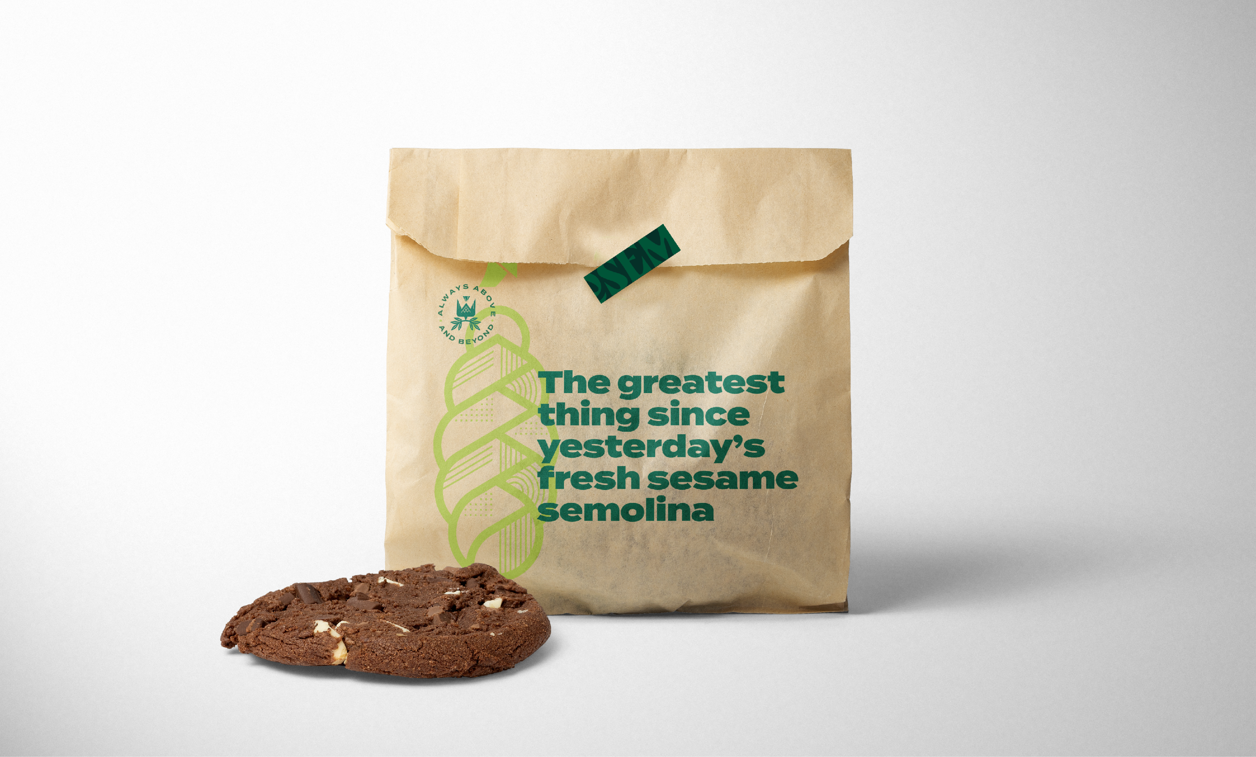
Using artistic iconography and a beautiful color palette, we created a design language that portrayed Rosemary’s finesse and attention to detail across all touchpoints.
the results
A shopping destination where customers walk out wowed, satisfied by the ultimate selection in kosher shopping, and gratified by their outstanding experience.
