Schreiber's
Case Study
Anything but cookie-cutter for this legendary Brooklyn bakery chain
the challenge
Schreiber’s Bakery is a popular chain of bakeries located in the Boro Park and Midwood (Flatbush) sections of Brooklyn. Renowned for their mouthwatering, home-style baked goods, pastries, challah, and more, Schreiber’s baked goods are the stuff of local legend, and especially sought-after for Shabbos and Yom Tov.
Although already popular, Schreiber’s came to us to help reposition the brand and its products, moving from local, homey shop to first-class bakery destination.
what was their next?
Our primary objectives were twofold:
1) Reposition Schreiber's in the community's mind as a brand that offers an exceptionally high quality product through a
warm, homey in-store experience.
2) By extension, build up the Schreiber’s product in a way that it could sell itself.
3) Boost market share; firstly in their flagship 14th Street location, then follow up by increasing sales in the remaining shops.
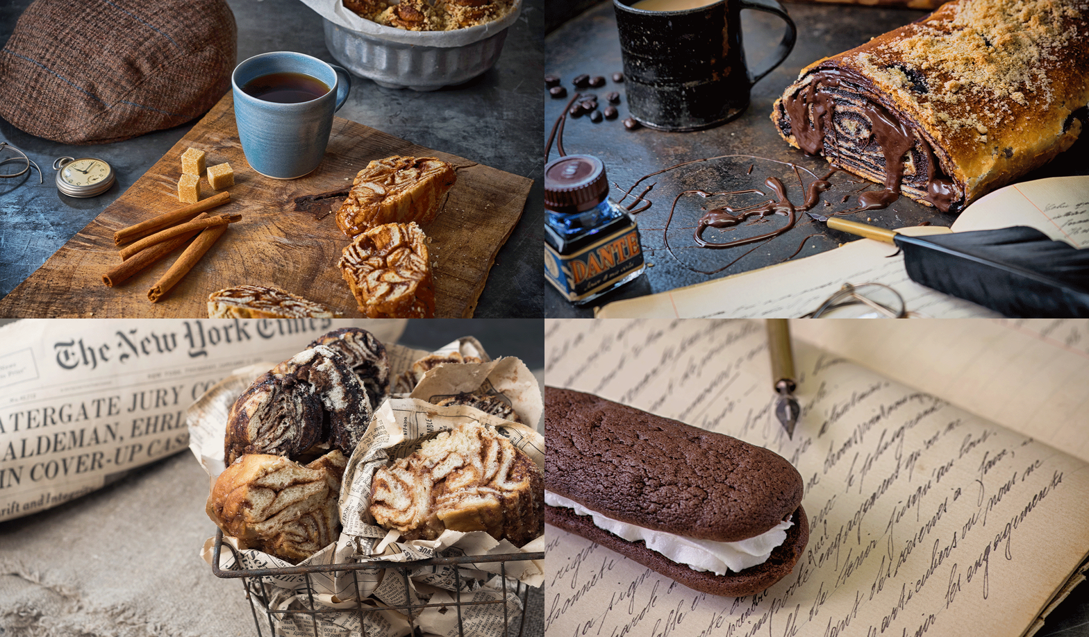
To understand what goes into the creation of a legendary brand, we needed to retrace its steps - all the way back to the turn of the 19th century. Handmade recipes, passed down from patriarch Tuvia Schreiber, to the next generations of Schreiber bakers.
It was this combination of high-quality baked goods, the art of a “Schreiber” (scribe), and the old-world charm it exuded that would serve as the basis for the ensuing brand.
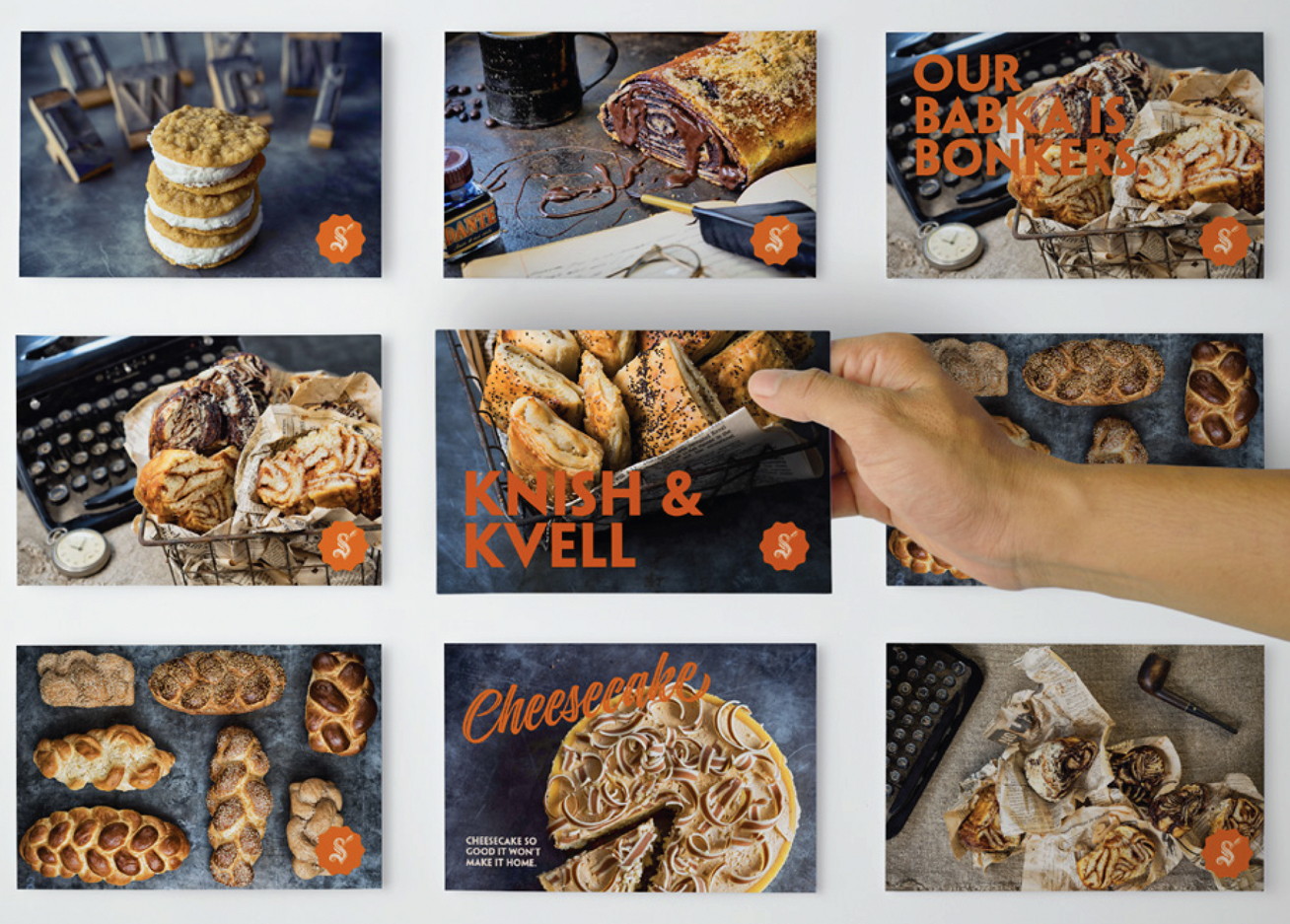
the process
Bakers, like scribes, cannot take shortcuts. There’s no way around delicately putting ink to paper or chocolate to rugelach.
Good dough, like a good story, needs to sit overnight-be tended
to and nurtured until it rises and is ready to stand on its own.
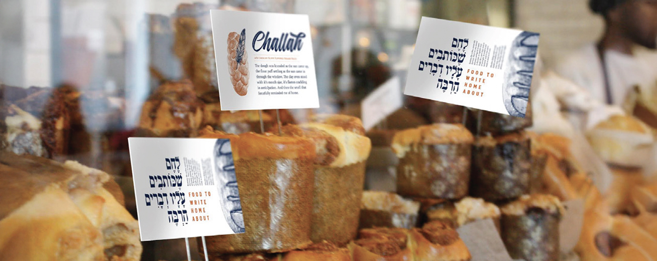
This was the essence of Schreiber’s: “Food to write home about”. Food made with love and commitment, an homage to the Old World, tradition mixed with contemporary flair.
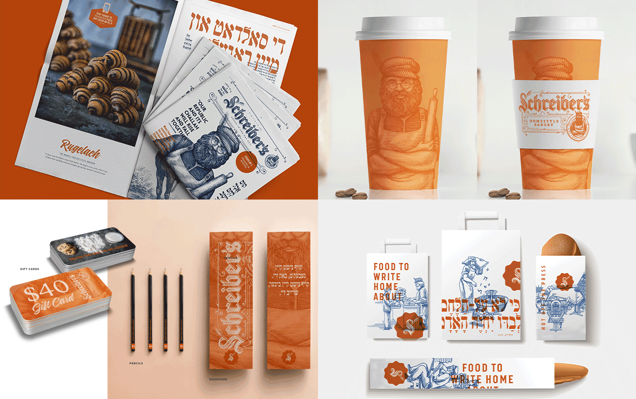
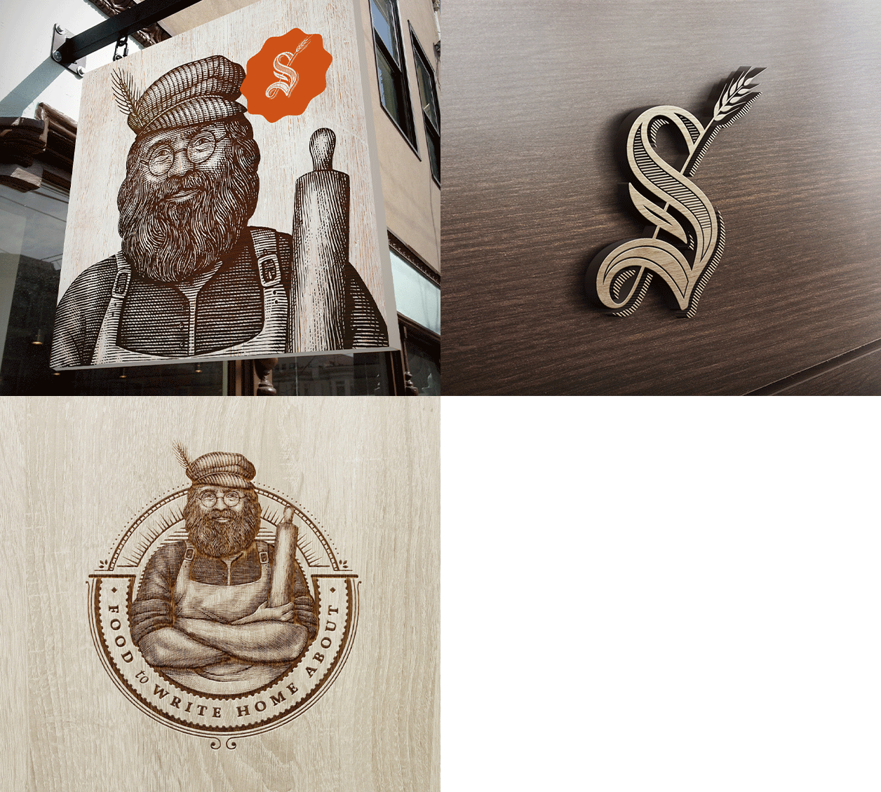
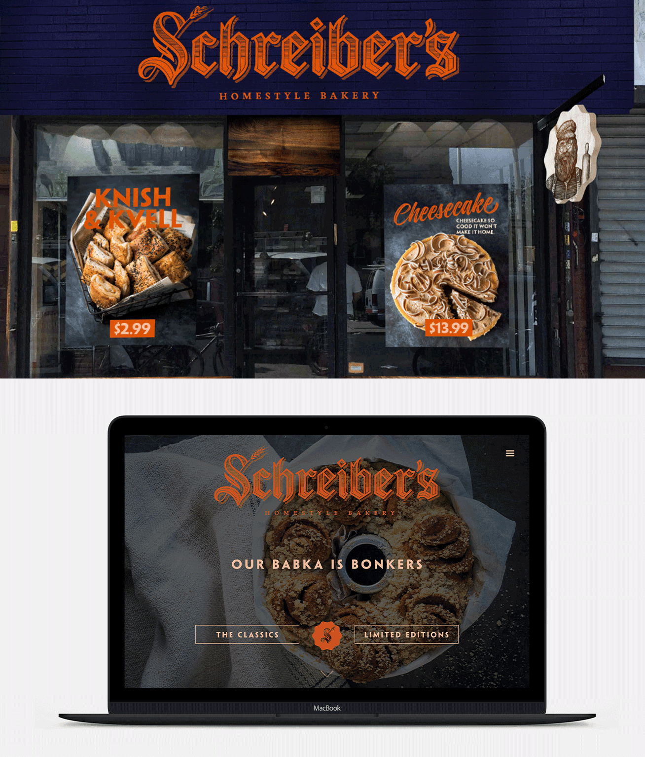
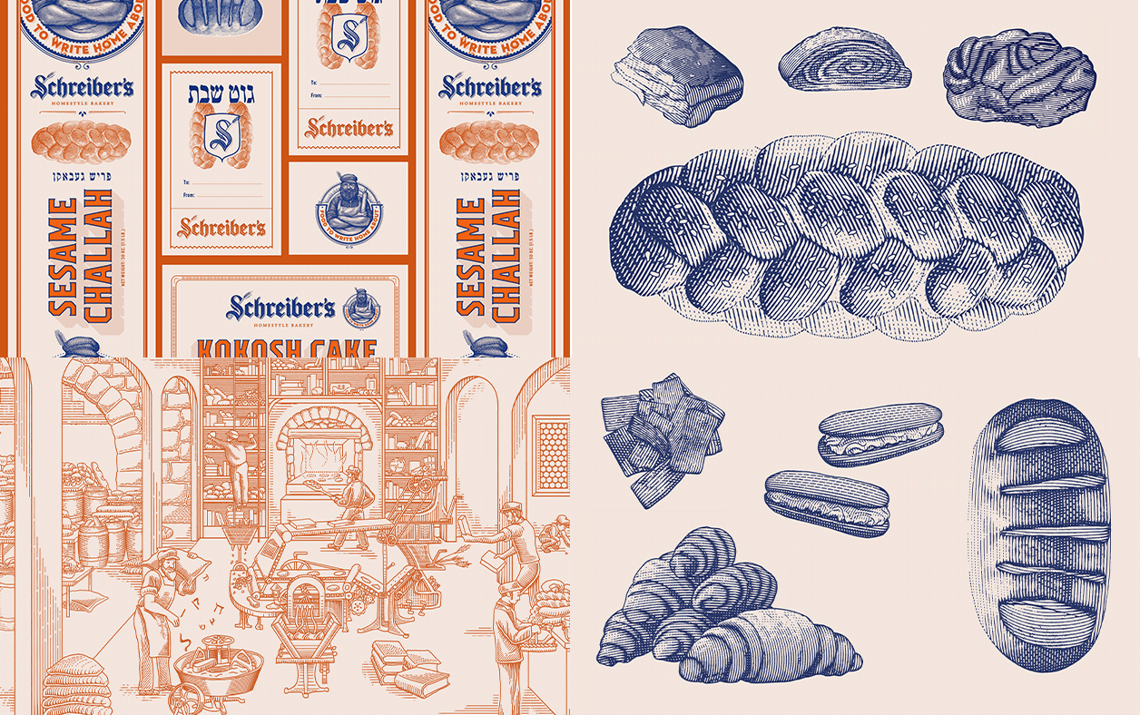
Visually, the brand platform was brought to life in a variety of applications. The logo reflects traditional craftsmanship combined with a modern aesthetic; a mixture of typefaces to provide a warm, handcrafted feel suitable and a vintage character; hand etching Tuvia, the brand “mascot”.
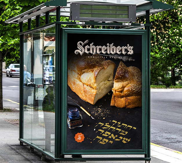
The comprehensive branding extended to packaging, store designs, murals, signage, and even newsletters and ad campaigns, all designed to create a cohesive customer experience centered on merging ancient tradition with modern culinary excellence.
the results
The Schreiber’s brand launch was hugely successful, and it has since become even more recognizable and beloved. The brilliant brand identity seamlessly blends with the signature Schreiber’s aroma, signaling quality and tradition to all who pass by and through its doors.
