Shlavim is one of Israel’s most extensive non-profits, with multiple robust programs under its purview.
Encapsulating all they accomplished and stood for into one centralized identity and message?
A Ptex-worthy challenge.
what was their
next?
Poised to begin fundraising in the US, Shlavim needed a way to articulate their overarching mission in a way that was profound, impactful, and relevant to a market unfamiliar with the nuances of Israel’s socio-economic landscape.
No less important was distinguishing Shlavim, among all other causes, as the unique donor opportunity it truly is.
the process
Research first. Output next. The team began with a deep dive into each of Shlavim’s numerous initiatives. An intensive market research phase helped paint a rich picture of their impact and mission.
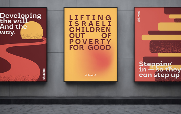
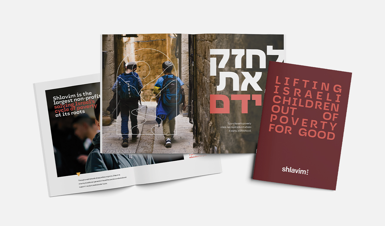
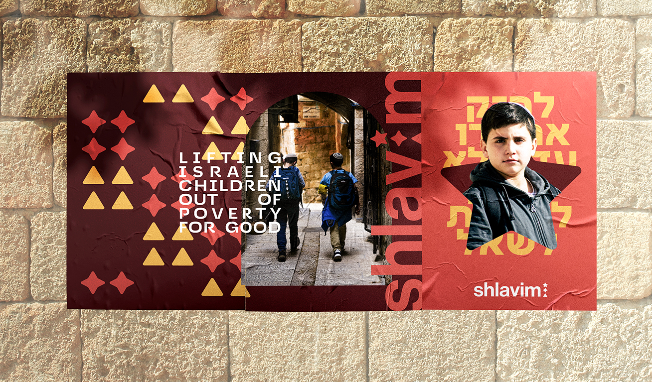
Once we’d identified Shlavim’s “why,” we summarized it all with a single point of clarity: “Lifting Israeli children out of poverty — for good.”
From there flowed a powerful narrative that painted the challenges Shlavim addressed, their unique and effective solutions — and a donor’s ability to have a real, meaningful impact.
Shlavim’s visual language intuits their mission of self-sufficiency in breathtaking simplicity.
Shapes work together as “building blocks,” telling the story of a child supported by Shlavim. Colors project warmth and strength in equal measure. Sophisticated storytelling elements layer in as needed.
the results
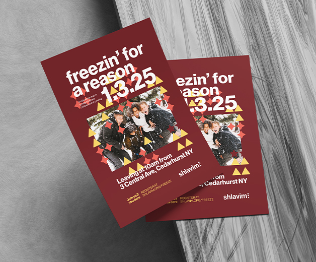
With a clear and powerful identity in place, Shlavim now has a powerful ask for donors all across the US.
Energized by the strength of their new branding, Shlavim’s fundraising team has jumped into its donor outreach with newfound confidence and pride.