Over the last decade-plus, patients have embraced the Urgent Care model as a convenient alternative to ER care and PCP offices.
With urgent care chains dotting street corners and strip malls, our client was entering a playing field dominated by massive, corporate-ran urgent care centers.
what was their
next?
While most urgent cares were competing on convenience (late hours, no appointments, etc.) and speed, we wanted to provide a more personal alternative to the faceless chains that dominate urgent care.
We knew that in an age where quality on-demand care was not just a luxury but an expectation, emphasizing the human side of the care experience was where we could truly stand out.
the process
We positioned Swift as an urgent care not just at the heart of the community, but with the community at the heart of it - run by, staffed by, and geared towards the people from the community.
We focused on a care experience that was more personal, more caring, and more culturally sensitive than any corporate national urgent care could ever offer.
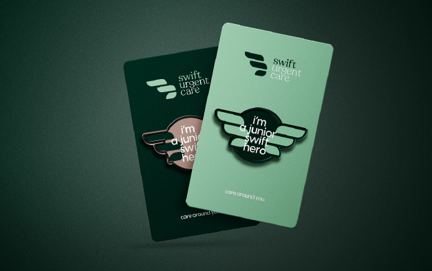
Our tagline of “Here to Care” had more than a nice ring to it, it set the tone for the entire patient experience– empowering providers and employees to create memorable personal interactions that would ultimately build incredible brand loyalty.
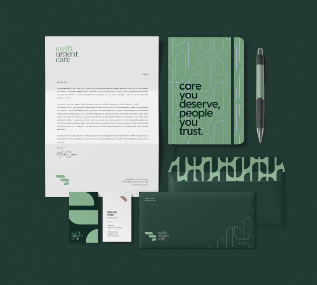
We used bright colors, bold typography, and clear iconography throughout the brand’s visual identity to create a look that conveyed medical professionalism with a friendly touch.
In addition, multi-lingual design elements were incorporated throughout signage and marketing materials to communicate that this is care that caters to all cultures.
the results
With a commitment to delivering a more personalized and dedicated care experience, Swift Urgent Care has expanded its locations and introduced numerous new services, all aimed at fostering a healthier, stronger community.