A new supermarket in a young, growing neighborhood needed an identity that would establish it as both the go-to supermarket for families in the area and the weekly ‘worth-the-detour’ kosher food experience in the greater Monsey and Rockland area.
Sticking to the same old was not an option in a competitive market. To attract and impress shoppers, we needed to provide them with an incomparable experience on every level.
what was their
next?
While great prices are a big component of customer satisfaction, we knew infusing good vibes into every touchpoint would foster long-term customer loyalty and retention.
Our team envisioned this store as more than a massive, top-of-the-line supermarket offering everything a kosher consumer could need, but as a vibrant, happening hub of Jewish life.
the process
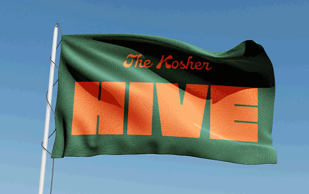
Our branding began with several intense rounds of namestorming. Once we hit upon the perfect name, the visuals and verbiage flowed from there.
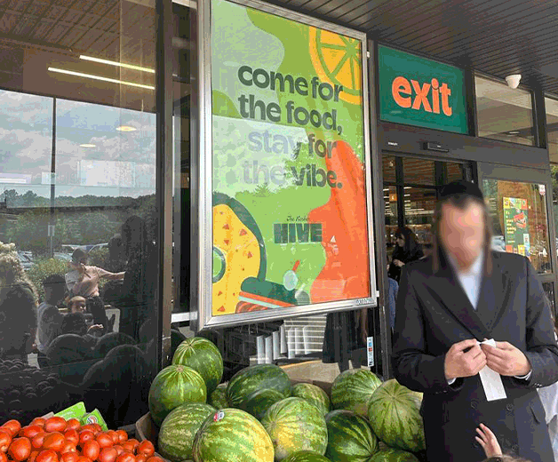
From lusciously red cherries and briny olives to fluffy, puffy challah, we used highly descriptive messaging to appeal to shoppers’ five senses, allowing the items on the Hive’s shelves - seasonal and staples - to come to life.
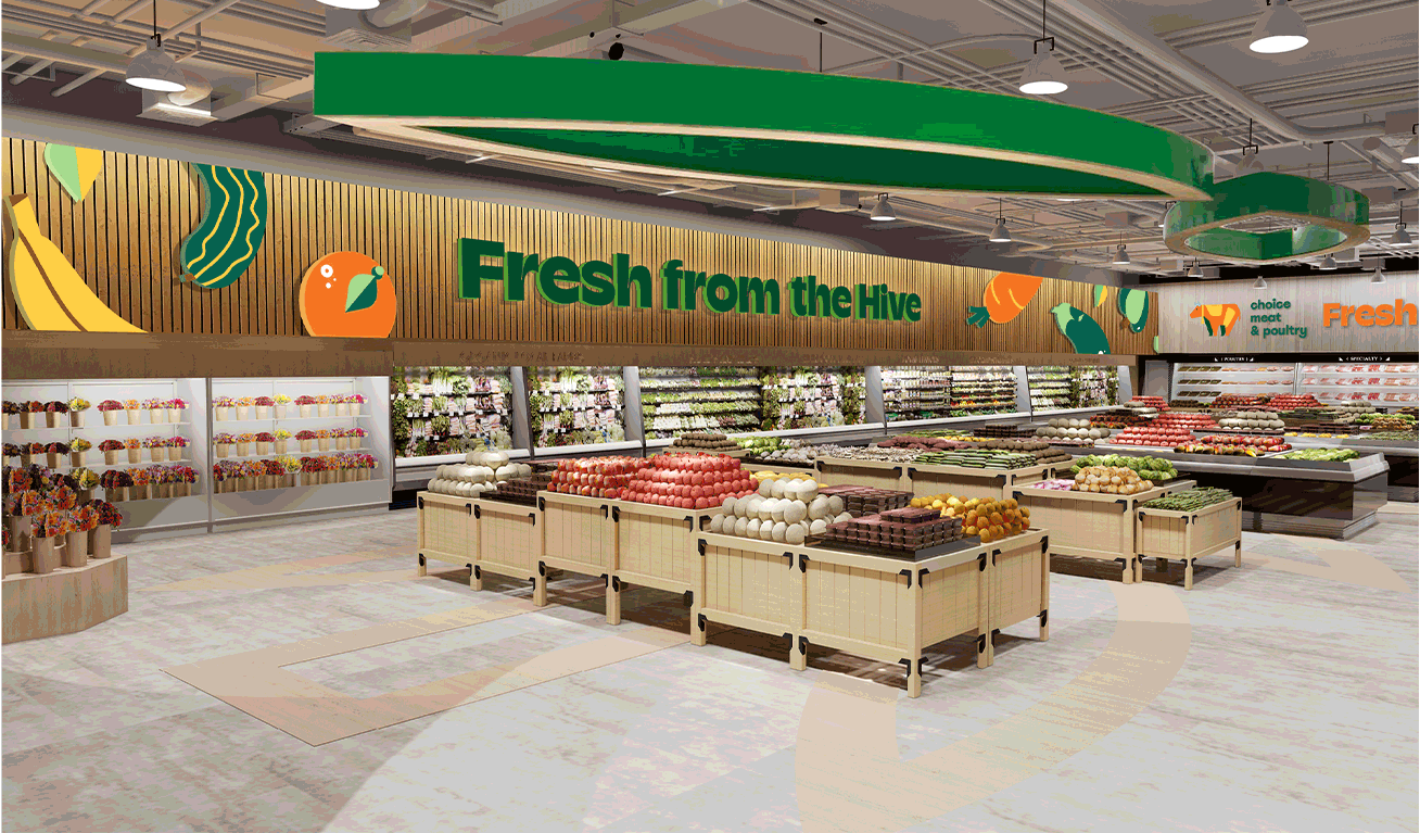
With bold typography, a vibrant color palette, and an adorable beekeeper mascot, we created a unique visual identity to appeal to shoppers of all ages.
Entering the store, the warm, inviting attitude is seen throughout the interiors. Our designers collaborated on the architectural graphics and signage, both interior and exterior, incorporating patterns and iconography that feel friendly, unpretentious, and easy to navigate.
the results
We took supermarket branding to places it had never been before- with our groundbreaking work winning the Ptex team the coveted GDUSA 2024 award.
Because more than a supermarket; we created a 55,000-square-foot experience. One that brings the vibrant cycle of Jewish life - Shabbos, Yomim Tovim, Simchos - to life in an explosion of food, flavor, and unmistakably good vibes.