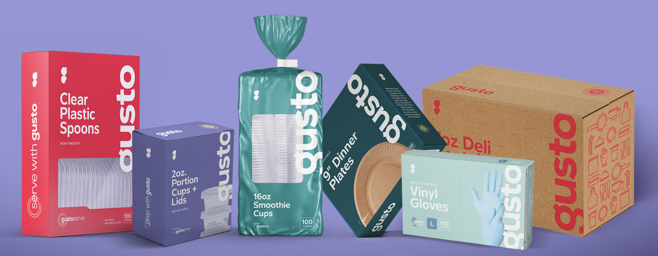
After significantly growing their line of top-quality disposables, Gusto approached us to create a scalable, robust brand that could go head-to-head with the leading national brands and cut through the clutter of competing, inferior, and undifferentiated Amazon disposables brands.
what was their
next?
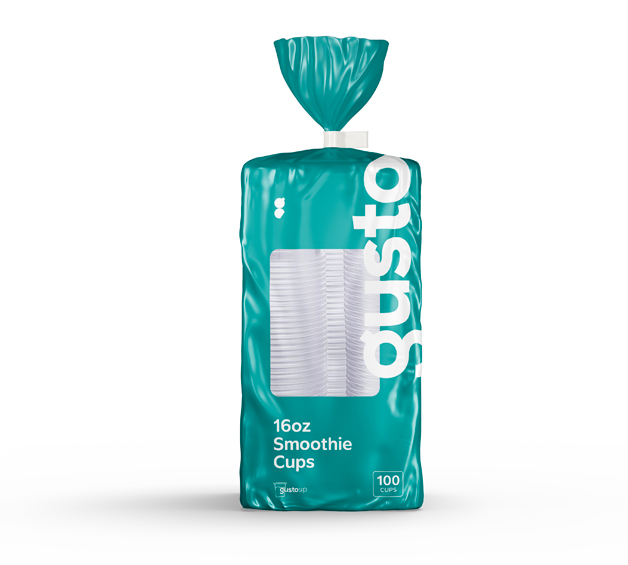
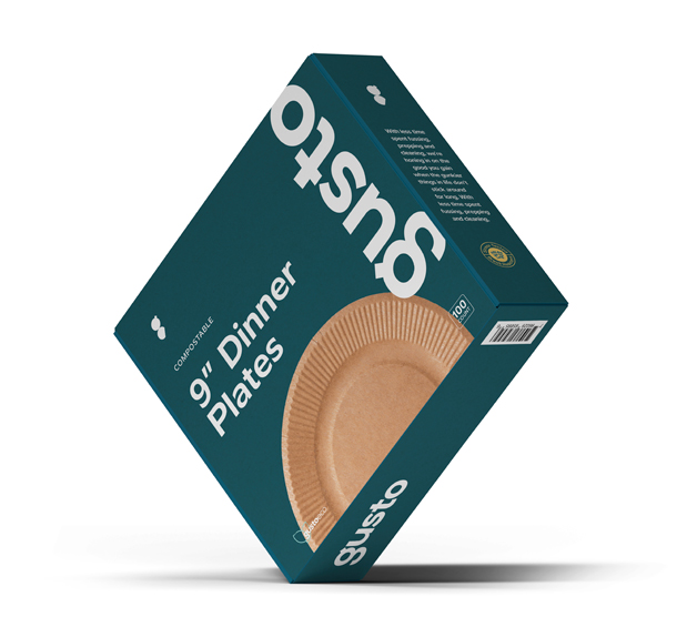
While their products are designed for one-time use, their obsession with quality meant that their disposables were strong enough to hold up to just about anything.
To establish legitimacy in the broader consumer (kitchen and home) and industrial (food service and office breakroom) spaces, we needed customers to know from the get-go that this was incomparably sturdy stuff - no leakage, spillage, or breakage here.
the process
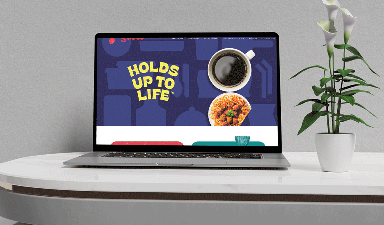
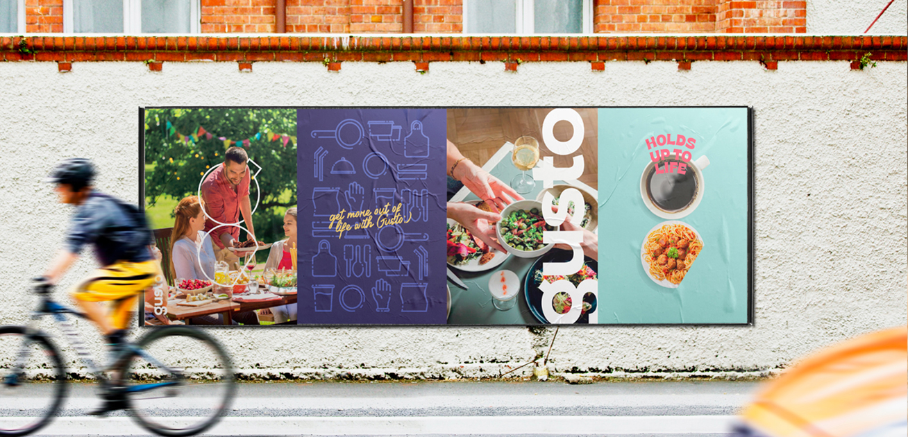
We wanted to create a visual brand that felt simple, effortless, with subtle premium touches.
The distinctive lowercase logo wordmark exudes friendliness and creates a bold identity that can easily be spotted from afar.
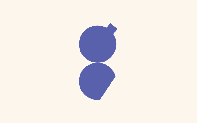
Comprised of two abstract shapes, the minimalist “g” shaped logo icon mark can be revealed to portray images of Gusto’s product line.
The brand’s products are grouped into sub-brands - prep, cook, clean, etc., each with a unique primary color and icon mark that allows customers to differentiate their various uses.
And while Gusto’s products stand on their own, we built a purpose-driven web community with hacks, tips, and tricks that allow shoppers to implement their usage in ways they never thought possible.
With a separate dedicated website, gustohacks.com, this online community builds incredible brand loyalty, and gives back to customers in the best way possible.
the results
With a fresh identity backed by a resonant why, the Gusto brand continues to win over customers looking for unbeatably tough disposables with a vibrant community thrown in for good measure.