For the average home cook looking for cheap, functional kitchen items, there were more than enough options.
Harthwood was looking to bring something new to the table.
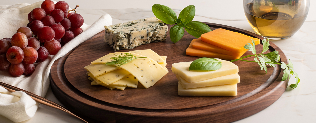
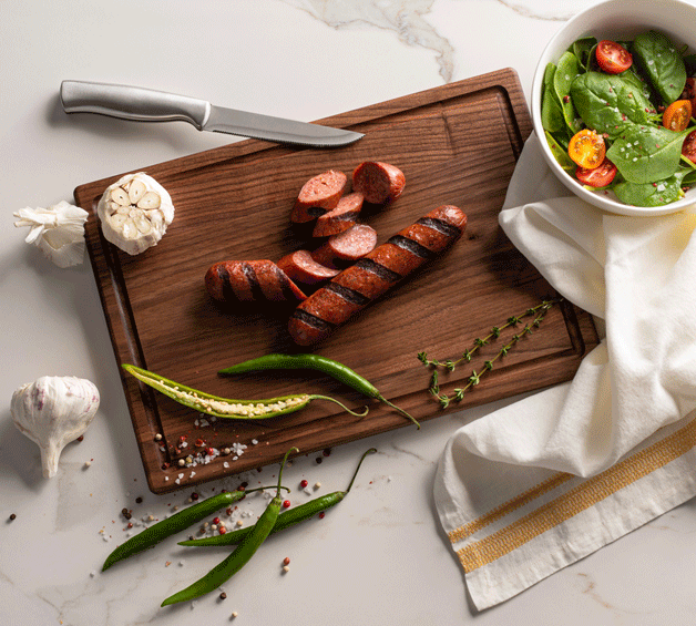
Their product line was designed for people who cared enough to work with products that were homegrown and carefully crafted.
Each board they sold was both aesthetically beautiful and effortlessly functional, made from honest-to-goodness authentic materials that customers could proudly use and display in their homes and kitchens.
what was their
next?
We needed to build off the allure and warmth of the products’ character-rich wood to create a brand that while new and evolving, was solid, classic and sophisticated.
As a brand that worked with earth’s basic, natural elements, we channeled the depth, richness and intensity of wood, steel, and stone throughout the messaging.
The tone of voice was warm, matter-of-fact, and direct, painting every item as a work of art - and heart.
Our goal was to pay homage to a heritage of timeless strength and beauty, while taking care that every word would resonate with the modern, minimalist urbanite and the honest-to-goodness, country-living consumer alike.
the process
We chose the logo’s charming calligraphic sans-serif typeface as a nod to classic craftsmanship, adding sharp edges to create a more contemporary feel.
Iconography was kept simple, allowing customers to grasp the product care and usage at a glance. We also used various seals to highlight the brand’s standout features, such as the fact that it was made in the USA and crafted of all natural, raw materials.
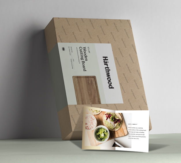
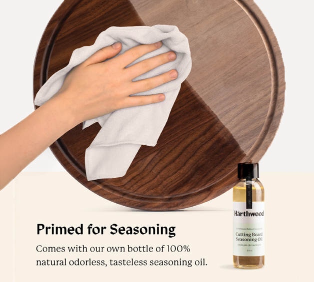
We designed sleek packaging that showcase the board’s raw beauty, with custom inserts to hold the seasoning oil and care packet.
the results
Here’s what two Amazon customers had to say about Harthwood.
“I never thought of a cutting board as being anything more than utilitarian. However, this one is special. It's a beautiful piece of wood that adds a touch of style to anything.”
“I was impressed with the quality and presentation of the packaging, written materials, and the product itself is 1st Class.”