A beloved fixture of a busy Brooklyn neighborhood, Mega 53 offered quality groceries, great service, and fair pricing.
But with new, shinier, bigger supermarkets popping up around the neighborhood, their offer of tried and true simply wasn’t cutting it anymore.
While there were those advising them to be “more elegant” and “more relaxing,” our analysis of the target audience told us differently.
Located smack in the middle of a high-traffic street, Mega 53 is surrounded by the sights and sounds of ambulances and trains blaring past. With the nearby train station and 24-hour synagogue just down the block, the bulk of Mega 53 patrons were rushed, busy, and definitely not looking for a leisurely shop.
what was their
next?
In a setting bustling with the harried and rushed, we knew that a calm, quiet brand was not the vibe we were going for.
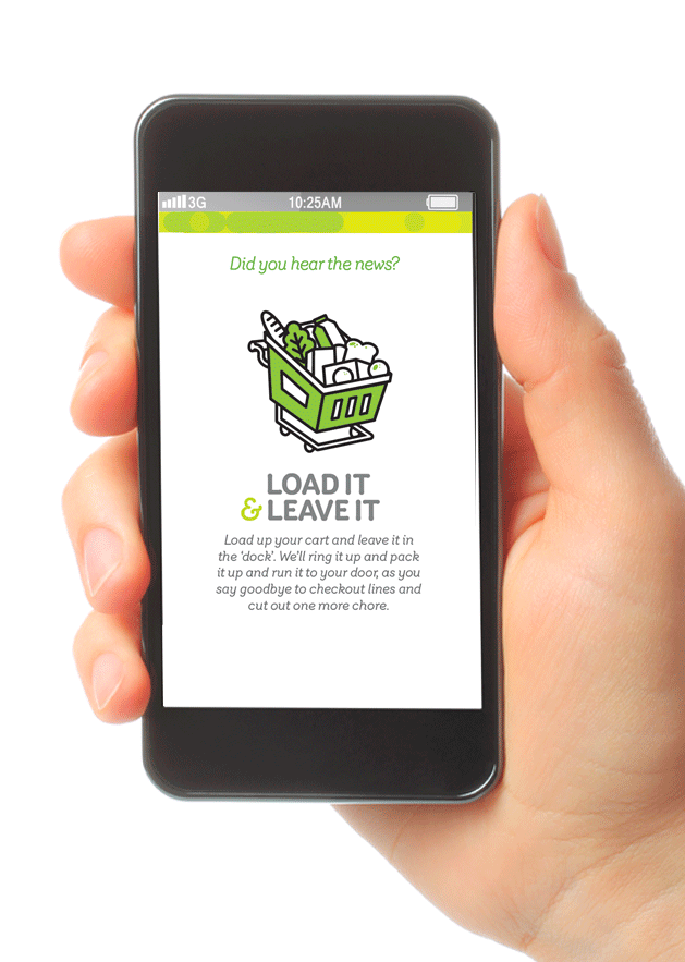
Mega 53’s shoppers needed to know that this was a store where they could walk in, find everything they needed (fast!), and move on with their day.
While some shoppers may be in a rush, no shopper wants to feel rushed.
We had to ensure that the messaging and vibe made it clear that Mega 53 provided fast service to those who wanted out, yet was a friendly place to hang out for those who chose to linger.
The tone was kept brief, simple, and direct, with enough pep and playfulness to hold even the busiest customers’ attention.
the process
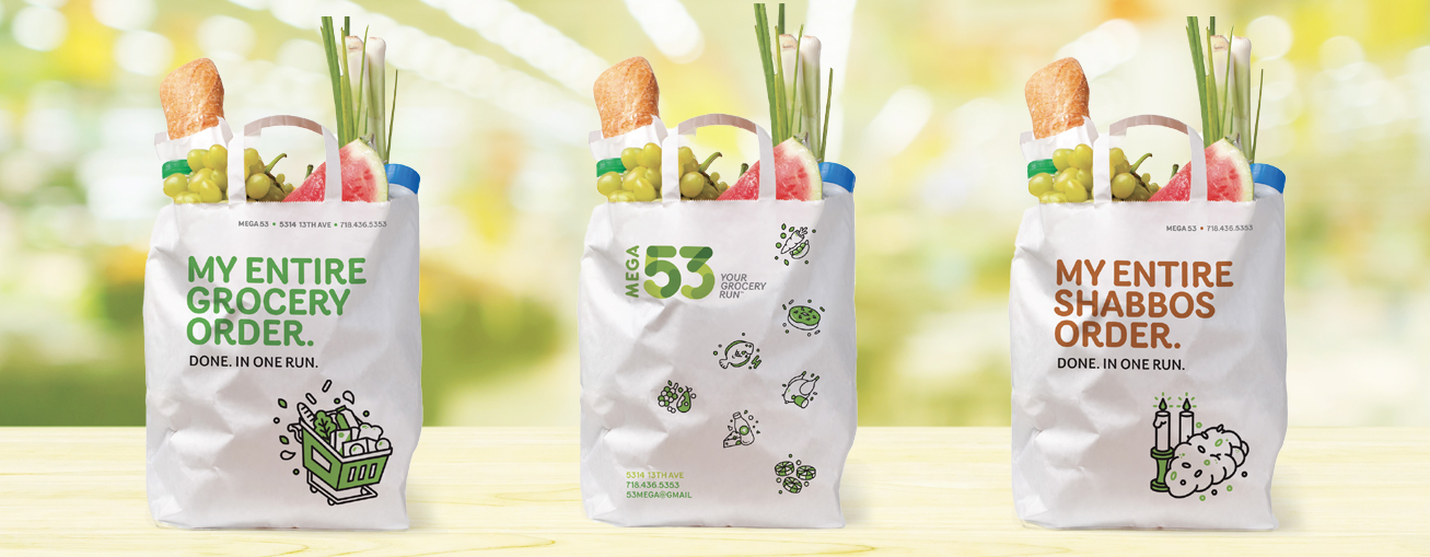
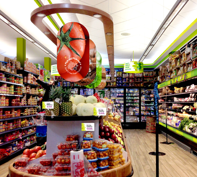
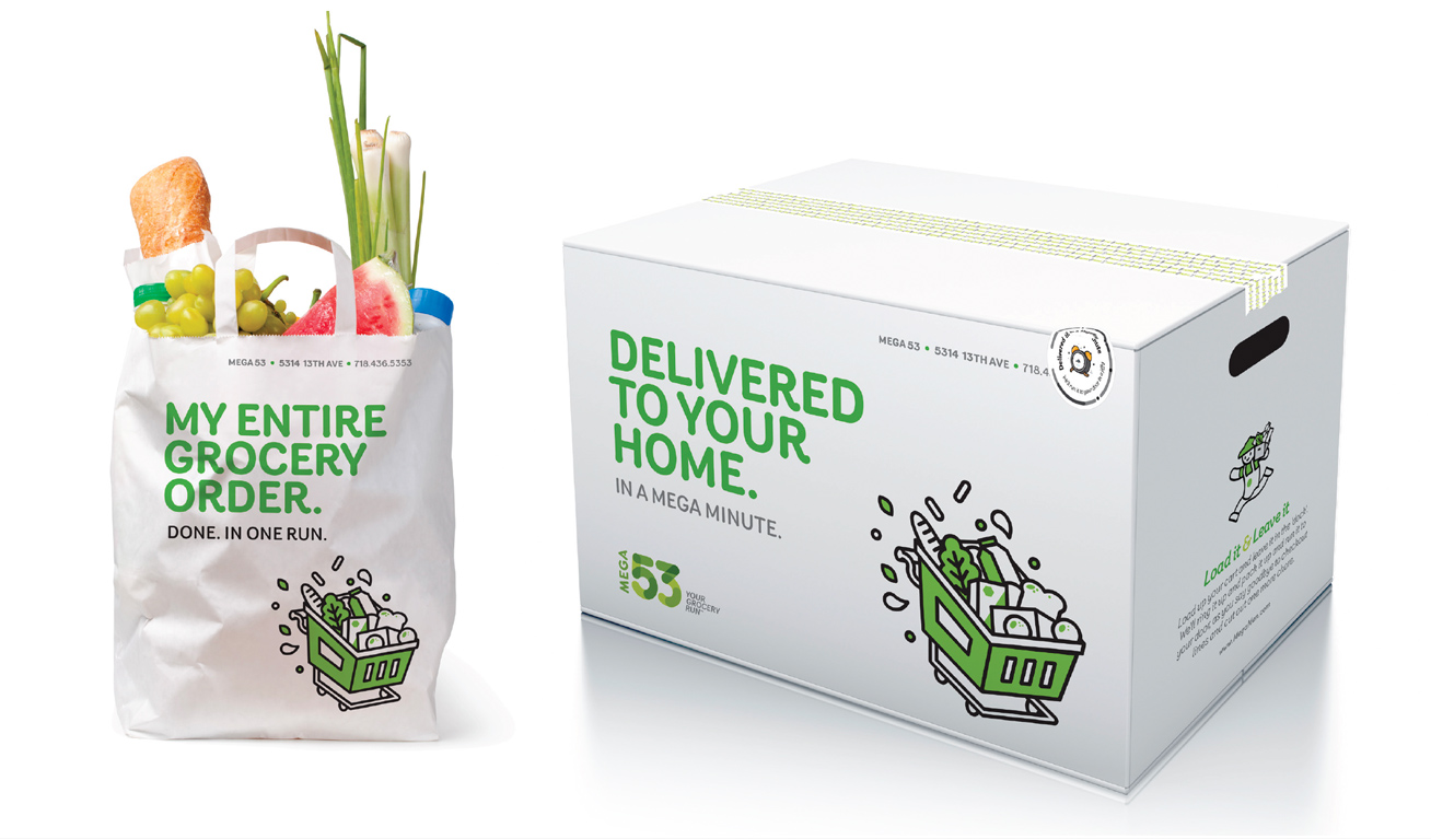
To mirror the hopping and popping vibe of the neighborhood, we created a visual rebrand that was energetic, fun, but most importantly- focused on clarity.
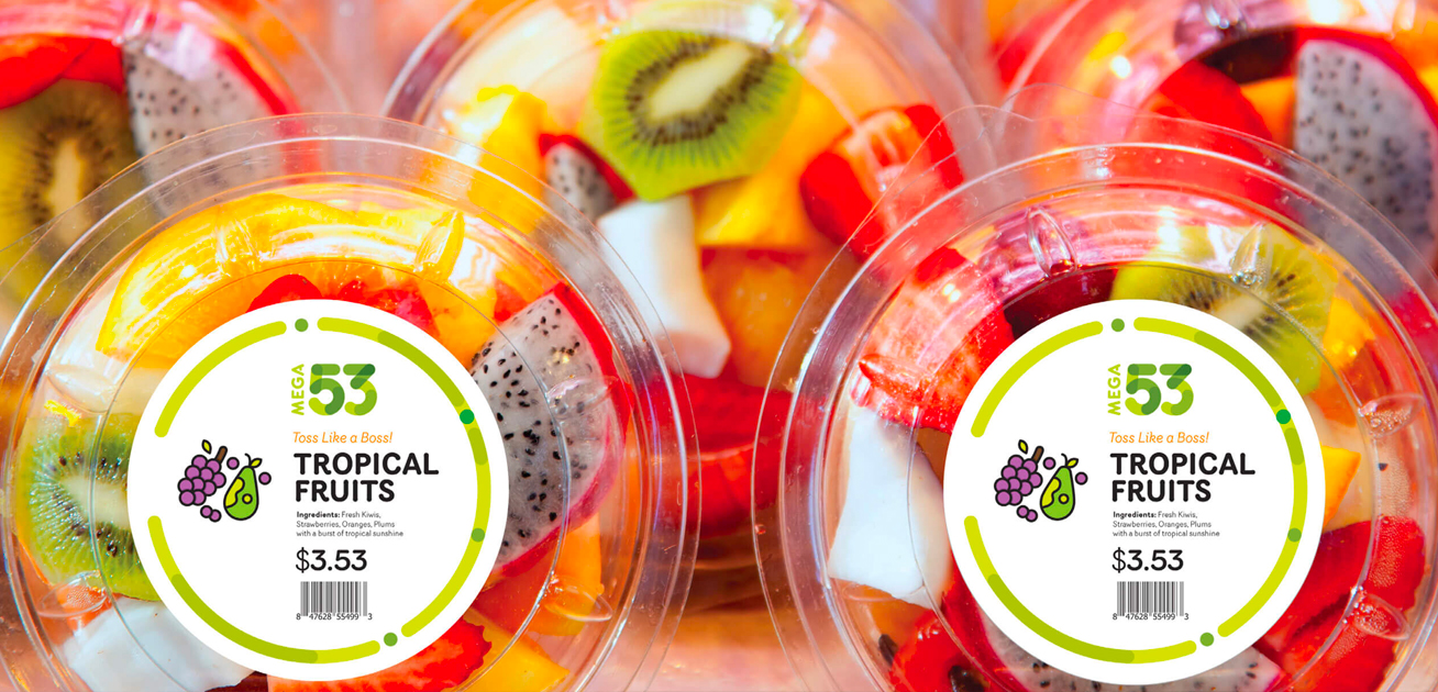
With distinct iconography and vibrant color schemes for each department- fish, meat, groceries, bakery, etc.- shoppers could find what they needed in no time.
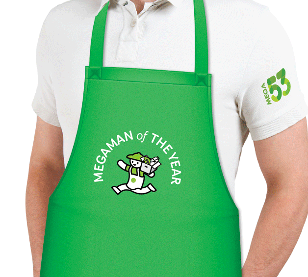
Highly visible uniforms and van wraps, accompanied by the “Mega Man” brand mascot, portrayed the element of speed, while attractive interior and exterior signage invited all to a pleasant, efficient shopping experience.
the results
We took a run-of-the-mill grocery store and gave it the character it needed to compete with the big guys.
Centered around the mission of speed and ease, Mega 53 quickly became the minute redefined; 60 seconds done faster.